Tuesday 22 March 2016

Studio Brief 2b - Applied Animation - Titles - NOS4R2


NOS4R2 (NOS4A2 in American publications) is a Horror themed novel by writer Joe Hill. The book is based around a character called Vic who's tries to save her son from a psychotic, supernatural killer called Charles Manx. The characters experience scary and bizarre encounters that involve themes of gore and psychological horror. The story line is a constant flow of creepy imagery and excitement. 

The two main characters, Charles Manx and his partner Bing Partridge, are both extremely strange characters. Charles Manx is the main evil in the novel, who entices children to visit his world called "Christmas land". His Vampire like features and creepy presence is something I am extremely looking forward to designing and experimenting with. There has been one graphic novel created based on this character and his dis-topian world full of children's ghosts. However, I would base my designs directly on the descriptions in the novels, and develop them to create a design that is true to the book.

At this moment in time, there are certain elements and key scenes from the novel that spring to mind, that I would want to include in my Titles. These include:
  • The Rolls Royce car.
  • The face of Charles Manx in the moon.
  • The gingerbread gas.
  • Bing partridge dancing with his dead mother.
  • Christmasland.
  • The shorter way bridge.

Even though the key elements of the novel are based around christmas, it is not a christmas novel, which is something I want to establish from the titles. I won't be having christmas as the main theme of the titles. The initial idea in my head at this moment, is a dark and dingy animation, that involves a lot of dull colours and angular shapes that evolve from one scene to another, that fully encapulates the show.

My next step is skimming through my copy of the book, and writing down, highlighting and sketching imagery from the book.

Studio Brief - 2b - Titles - Initial Ideas


When given the brief, I had the option to chose between creating Television Channel Idents, Opening Titles for a Tv show or an Advert for a Campaign.

I was mainly drawn to the first two briefs, because I feel as though they offer a lot more creative freedom and weren't as serious as the other two. I'm more drawn to themes that don't involve a lot of seriousness. 


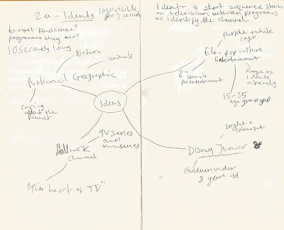
I created a mind map to conjure up ideas for the Idents brief. I considered target audience, themes and catchphrases of each channel to think of related words. I also considered how I would interpret the idents visually. For example, E4 would be great for creating idents because of the creative freedom that is allowed. National Geographic would be a good opportunity for me to develop my animal drawing skills, as I would gather images of various animals and animate them moving through a scene, with the National Geographic logo popping up at the end. Creating a Disney Junior Ident could be difficult, as there are a lot out there and the colour palette and imagery used is usually limited to the primary colours. Their Idents tend to be 3D, and I find using Maya difficult, and it would be hard for me to create an ident in the amount of time given, considering I have never used the software before. The Hallmark channel would be a strong one to do as the channel broadcasts a lot of reality tv. My idea was to create a silly idents of characters of different TV shows arguing.

After considering the various Idents I could create, I decided against going for this brief as I felt creating a title sequence for a book of my choice best suited me as my aim is to create a mixed media piece, mainly using ink and paint because I haven't experimented with this type of animation before.


Here I considered two books that I thought of initially. The first book I considered was High Fidelity, a book by Nick Hornby. The tone of the book is chatty and down to earth. I feel as though I would find it difficult to animate a title sequence because of the relaxed and believable vibe of the book. My aim is to create a titles sequence that is interesting and involved a lot of movement and animation and I feel as though I would get stuck creating a title sequence consisting of still frames and names that are typical of drama series. The book has already been adapted into a film, however, the book has a very British and witty sense of humour, and the film was Americanised and adjusted. 

I also considered Filth by Irvine Welsh. I came to the conclusion that the excessive adult themes would be difficult for me to animate. However, the tapeworm in the protagonists brain is shown through '0's across the pages of the book, blocking our paragraphs to demonstrate his messed up state of mind. I felt as though this would be something interesting to animate across the screen, while names show. Filth has also been made into a feature film, that's a similar style to the book, that contains adult themes.


The last two books I considered are drastically different from each other. One is a toned down, chatty narrative about a teenage boy who likes skateboarding and manages to impregnate his girlfriend, with witty jokes and funny scenarios. Whilst the other, is a horror novel based around themes of murder, kidnapping and a bridge that transports people to different places. 

Slam is based around a teenager that likes skateboarding and gets his girlfriend pregnant. The style of writing is chatty, similar to Nick Hornby's other book, High Fidelity, that I researched. However, the target audience is mostly teenagers and young adults, which could give me creative freedom to create a graphic style that involved key elements and themes from the book, such as pregnancy and skateboarding, as well as London, where it is set. I could research into Urban London, and extract an industrial atmosphere, and have graphics-style graffiti of sperms and skateboard appearing and moving on the walls of the city as the camera pans through.

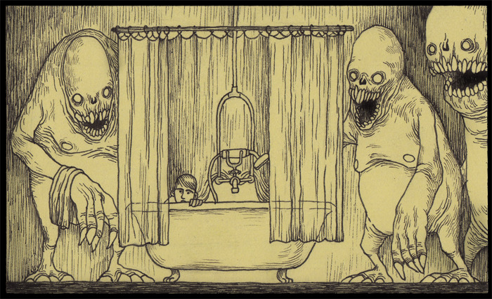
NOS4R2 is a supernatural, horror novel that has various dark themes that centre around a child serial killer called Charles Manx, who kidnaps children and takes them to a dis-topian world that he calls "Christmas Land". 

After considering and researching the books I wanted to do, I decided to choose NOS4R2. I feel as though this would be a strong book for me to create a mixed media piece for, because of the dark and vivid scenes that are described throughout. 

My next step is to re-read NOS4R2 and pin point key images and scenes I want to create in my title sequence.


Thursday 17 March 2016

Visual Language - Captain Character - Black and white


Here I created a black and white rendered version of my character by using grey scale. I also drew over a mini chewing cycle I created in order to properly see the flow.

In the top right hand corner, I created a version where I used a circle as the base for the head, and then added the fleshy parts of the face to demonstrate the soft skin that hangs off his face. 

I also drew over some emotions to create a clear image of my characters expression. I did all of this to further my tablet drawing skills because if I was to animate my character, I would do it digitally.

Visual Language - Captain character - T-pose


Here is a pencil T-pose. I had created a light grid in the background to create boundaries to work from. I found it easy to re-create my character in this pose as I was comfortable at drawing my character at this point.
This is my digitally rendered T-pose. I decided to create a rendered version to further my tablet drawing skills and also to create a clean version. I still kept the sketchiness of the original as I feel that if I was to animate my character, I would have a sketchy and wobbly look to it.

Evaluation - Visual Language


Over the course of these past few weeks, I feel as though I have developed an understanding of a broad range of drawing practices and techniques for me to better my drawing skills.

With the form, flow and force brief I was asked to create a sense of movement through a range of drawing techniques. Because I am experienced with life drawing, I found it easy to adjust to the fast pace of the drawings. I enjoyed switching off for a while, and concentrating on creating movement from a series of still sketches.

Captain Character was probably my most enjoyable brief. I enjoyed learning the stages of creating a character with close referral to the description I had made. I learnt a range of techniques and requirements when it comes to designing a character. I feel as though I have developed my tablet drawing skills also. I tend to keep the sketchiness of my drawings even in a digital form, however I feel as though I paid close attention to cleaning these lines up and creating smooth edges.

Environmental story telling was a challenge for me. I feel as though I pushed myself too far in the direction I wanted to go in. My intention for a few of the drawings were to create a block coloured effect, common in most 90's and early 2000's animations. The pieces I attempted to create turned out messy, and hard to decifer. I feel as though I should of worked on my perspective further, rather than drawings objects and hoping for the best by adding a couple of perspective lines.

Set, Series, Sequence was probably my favourite brief. I enjoyed the progression from a word to a story board and it also enabled me to experiment with different mediums mindlessly, instead of feeling like everything had to be clean. I feel a lot more comfortable using physical mediums rather than tablets in Photoshop. This has driven me to experiment with a mixed media animation for my next project. I will do further research and hopefully find a comfortable ground in animation.

When creating a physical version of my character in my workshops, I was comfortable. I enjoyed creating detail in my armature workshop with plastersine. However, I found the wood work shop difficult, as I shot too high and designed a model that would take a lot of time and precision. It took a long while for me to finally feel comfortable using the large machinery as I am extremely accident prone.

Overall, I found each drawing task extremely helpful in developing my drawing and thinking skills. It enabled me to switch off for a few hours and focus on the mediums I enjoyed. In the future, I will definitely apply the drawing practices I have gained into my projects. I aim to also feel comfortable sharing my own work, as I feel my incapability of sharing my own personal sketchbook work to be difficult.

Visual Language - Set, Series, Sequence - Don Kenn


Don Kenn is one of my favourite illustrators as he combines dark imagery with childlike themes. His work has a yellow tone to it, and is worked over the top in black ink. I find that creating a wash of colour as a base for a design can shift the tone of the sequence.


Hi composition is always sequential and set out to clearly capture what is going on in a scene. They aren't the usual layout however they add character and an atmosphere. 


By utilising the rule of thirds, Kenn creates a composition that leads the eyes through the illustration. I will take into account the illustrative composition that Don Kenn demonstrates though his series of work.


Visual Language - Set, Series Sequence - Mike Ploog


I decided to look at storyboard artist, Mike Ploog, as I haven't looked at this aspect of sequential imagery yet. I enjoy his work as the sequential images he creates are clear and involve expressive movements.


His scenes are detailed by using dark pencils. He manages to create a sense of action and movement through the way he draw his characters interacting with each other.


He creates a sense of scenery in the small thumbnails that he creates by creating perspective through the shadows. 


Study Task 2 - Environmental Storytelling - It's such a beautiful day


It's Such A Beautiful day is and animation created by Don Hertzfeldt. It deals with themes of memory loss as well as humour.


This animation is a perfect example of utilising images to create an atmosphere. You never really see a fully formed background, it is always just certain aspects of the environments.

Combining photography and simple animation is perfectly executed in this animation. The animator uses little visuals, yet gives an intense and emotional pay off.


Using a pin-hole effect, Don hertzfeldt creates sceneries and atmospheres in a direct and experimental way. It makes the viewer focus more on the dialogue and what's going on rather that having complicated backgrounds that distract.


Even though the animation is based on a stick man, it is laced with serious themes. Here, You can see how the animator as imposed the silly designs on top of a hazy and warm background to evoke emotions. This scene is a content scene. To portray a sense of forgiveness, the background is warm and in turn, gives the animation a deep and emotional feel.

Visual Language - Form, Flow and Force - Snow White


Snow White and the Dwarves is an animated Disney movie. The animators did create life drawing images, however, the whole animated feature was Rotascoped.
This process can help animators create fluid and life-like movements without a lot of reference material.


The clips show a woman dancing and flowing around. By rotascoping these clips, the animators were enabled to capture the movement of the woman herself, as well as the movement of her clothing, which can be difficult to animate on it's own.

Overall, I would like to try rotascoping at some point, as I feel it is a technical and key animation technique.


Visual Language - Form, Flow Force - The Little Mermaid


Disney are reknowned for the intense life drawing session they put their animators through. I decided to look into The Little Mermaid.


The process in which they managed to capture the smooth and slightly realistic movements of the characters were through a series of clips. The Director and Animators had a young woman act out each scene in order to create a detailed and accurate reference point.


The animations compared to the original clips the animators worked from seem a little silly. However, they manage to capture the fluid movements successfully by paying attention to the line of action played out through the scene.


After researching into this process, I have learnt that this is a useful technique. By filming actions, you have constant reference material that can be repeated and drawn from however many times. I will apply this technique in the future when creating fluid movements in animation.


Visual Language - Camptain Character - Coloured Sheets


These are my rendered coloured versions of my character. I decided to stick with block colours and not add a lot of shading as I haven't experimented with this technique before. 

I kept the skin a dull pinkish/ grey colour and layered over a low opacity shade of pink in different intensities. 

The one I prefer is the one where he has a white shirt, black pants and purple belt. I like the intensity of the sweat patches against the white/off grey shirt as it gives a character a sense of grossness that I had lost throughout my design process. He was starting to look a little cute, so adding little details like this one can shift a characters appearance.

Visual Language - Set, Series, Sequence - The Walking Dead


I decided to look at The Walking Dead because it is a form of sequential imagery that portray a story.


I chose this Graphic Novel because I like the bold grey-scale style as well as the linear and gruesome style that is present throughout.


I will take inspiration from this graphic novel in the sense that I want to develop my linear drawing skills. I find it difficult to keep a steady hand when drawing with pen and ink.


Visual Language - Set, Series, Sequence - Joan Cornella


I decided to look at the artist Joan Cornella because his work consists of a sequence of images to create a comic strip like piece. His work is brutal and funny and has a clear and bright style to contrast the dark comedic jokes. 

Because my concept for Set, Series, Sequence has a gross comedic tone, I decided to take inspiration from Joan Cornella's work in the aspect that his drawings are brightly coloured and clear.

Model Making - Captain Character


This is my wire armature. I opted to use thicker wire in order to create a strong base to build on top of because my character would end up weighing a lot, due to the large mass of his body. I referred consistently to my initial sketch, where I had mapped out where sections of wire would meet other sections, and also where the Milliput would have to be in order to secure the joints.

Because I was made to add screws to the feet in order to attach them onto a board, I had to adjust the size of the feet compared to my character designs.

I created a circle for the head to attach to in a sturdy way.


Here, I built on top of my wire structure with foam. Foam is light yet sturdy, and makes for a great base to build on top of further. I added masking tape for the plastersine to stick to.


Here, I added textured sticky plaster shit to ensure the plastersine will stick to it. I also used it as a way to bulk out certain areas.


Before adding detail I created a base layer of plastercine to create the overall shape of my characters face.


I created glasses out of some spare wire, however I found it difficult to create them so small and perfectly round. I ended up created little eye holes because the character looked too weird without them. If I were to make this properly and wiht he correct materials, I would create glasses that blocked out the eyes to keep with my designs. I added a little bit f pink plastersine to the cheeks and nose to keep with the colours I had given my character. I also added individual strands of hair. I also attempted to use plastersine to shape the body. I was initially going to use the plastersine as the clothes, however I saw this as an opportunity to experiment with creating miniature clothes for future reference. I found it difficult to smooth out the body as it was cold.


Here, is my character fully finished. I used felt for his clothes because other fabrics I had looks at were too soft and wouldn't stick to the plastersine, and I wanted to be able to slightly mould the fabric around his figure and create wrinkles. I had to improvise his shoes and create big bulky ones to cover up the screws and milliput.

Overall, I found this work shop helpful, however, I would like to create a proper armature suitable for animating in the future.

Form flow and force - Push it


I used oil pastels to capture the tension of the person pulling on a fridge door, with their leg propped against it for support. When sketching, I focused on the tension built up in the arms by defining the muscles. 

The beanbag was used as a way to capture a pulling tension from above. By focusing on the object as well as the person, a sense of tension can be identified.

Here, I emphasised the tension from someone pulling their shoe off by utilising negative space. I created scratchy horizontal lines around the figure to symbolise a sense of tension.


I decided to focus on the line of action ore on this one. I created swift movements with a pen to emphasis where the flow of action was. I added tension by exaggerating the calf muscle area as well as the biceps. 


Overall, I found this exercise helpful in creating a sense of tension and movement and will use this exercise when trying to capture movement in animation.

Study Task 2 - Captain Character - Coraline Character Design


I decided to look into the character designs from Coraline because of the vast images that are available and how the characters personalities are captured perfectly.


Coraline is a child, and her personality is captured through a series of poses, facial expressions and feature placement.


By utilising the placement of facial features, Coraline is given a lively and expression personality even when the face is blank.


Using a skeletol base can help animators and designers understand the characters facial features further. This sheet was probably created so the character could be physically created into a model. Thes would be extremely useful to the production department to work from in order to correctly capture the characters facial features.


This is probably my favouite piece out of the set of character designs. This is because it's a lot more detailed in order to translate into the 3D models. The flacid skin is captured through the use of shadows and exaggeration of weight.


A mixture of shapes were used to create this character. The nose is a large triangle, making the nose a significant facial feature. All of the characters from Coraline have distinctive facial features.


Creating sheets that consist of mouth movements in the early stages can help other people who are part of the production process have guide lines. This sheet in particular can be utilised in the later stages when actually animating the character.


Wednesday 16 March 2016

Form, Flow and Force- Like a puppet on a string


These images were based on a person moving through a space. They are movement cycles, layered over each other in order to develop my drawing skills, where the person squashes and stretches.


Here, I focused on creating a sense of movement by capturing the model shifting from a crouched and balled up position, into a tall and structured position. Alternating between colours enables me to look on each pose and clearly see where the lines lead.


I decided to bulk out the figure in order to capture weight, however, it gave the figure a more comical look and lead me not to focus on the line of action that happens in the body during motion.


I focused on the main structure of the person here. I decided to focus mainly on the line of action that was being demonstrated through the persons body.


Because I didn't take into account the size of the page, and the size of my drawing, the images ended up being squashed and muddled together.


Here I spread out my images in order to create a clear motion between each pose. I decided to use stick men to help me focus on the broken down lines within the figure. However, this cause the lines to become straight and lacked in movement.


Overall, this exercise was useful in creating an idea of what frames and poses would go into a movement. I will refer back to this exercise when creating movement in animation in the future.