Wednesday 17 May 2017

Applied Animation - Study Task1 - For arguments sake

I was tasked with the challenge of creating a powerpoint presentation on why brexit is terrible, even though I'm extremely politically unaware. My research consisted of facebook articles as well as an awful lot of rants from fellow peers and house mates. 


I tried to add a little bit of humour to my presentation, but as per usual, I missed the mark on more than one occasion due to me stuttering and mumbling.


I feel as though overall, my presentation skills are getting better. I made my notes and revised them but also used the presentation to prompt thoughts that I hadn't written down. I think my confidence is building, and I just need to work on slowing down when talking in front of large groups of people/

Tuesday 16 May 2017

Applied Animation - Week 11-12

These 2 weeks I have focused on animating. Because of health issues, it has been difficult for me. It has been difficult to communicate with my group as I haven't been in.

There was a crit where we received feedback for our animation so far. I was unable to attend. Some of the gags that we had in it didn't make much sense to people apparantly.


Tess took my concept design and created an amazing painting of Keith to use on the posters in our animation. I feel as though my part of the animation doesn't include a lot of movement, and because we aren't fully finishing our animation, I feel  as though I have been quite lazy with the colouring as well as cleaning up my part. I decided to stick to my character designs and use The Ultimate pastel brush. I do plan on re-designing these scenes as I'm not happy with the colour's of the interviewee as well as Keith's movement. 


Because the compositing and sound was being done by Jay and Tess because I'm not very experienced with that sort of stuff, I was given the job of re-doing the DVD cover.


This was the draft that I was given. 


This is something that I feel captures Keith's personality perfectly. I added a frame around the painting of Keith and also added some funny quotes on the back to set the tone of the Animation. I do hope that over summer we complete this animation for it to be submitted to festivals. I've enjoyed this project a lot and feel as though I have learnt an awful lot.


Applied animation week 10

Tess and Jay decided to record the voice of Keith. Max did a really good job at vocalising Keith's attitude and his pronunciation  was exactly how we imagined.

We also developed our final animatic. We took into account the feedback given at the group crit last week, and I feel as though we have successfully translated our script into a visual animitaic.


Our next step is to start animating our scenes. Because my scenes are quite short, and because I put a lot of movement into my animatic, that I know where to go from here.

Applied Animation - Week 9


Because we wanted to take inspiration from the "Eleanor Rigby" part in The Yellow Submarine, we decided to combine the original images taken by jay, and the mono-prints created by me and Tess.


This is a video of all the final backgrounds. I feel like my groups contributions to the backgrounds have been successful. 
Here, I started on creating a turn around for Keith so my group can roughly understand Keith's amazing physique. I started to create a full turn around, however, I messed up with the file and somehow managed to corrupt it in the process. Because we want to take inspiration from the animation "Mr Madila", the rough shape of Keith should be kept, but significant features are crucial, such as his eye brows, hair and calves. His suit and body shape and size is left to interpretation. WeWant to use the same brushes and roughly the same colours so my next step is to create a style guide.

Applied Animation - week 7


We all decided to help finalise the script because it seemed it was taking a long time. We took a lot out, and also colour coded it so we knew who's scenes where who's.


This is the interview scene of my animatic. There's no sound yet because I'm not too good at adding sound to animations so Tess and Jay are going to add sound to it in the final animatic. 


This is our first animatic with sound. The animatic is a lot longer than we anticipated, however we do plan on working out the timing of the animation as it's clearly off. The comedic timing of the jokes will hopefully translate better once we have finished animating as it's clear that the timing of the jokes are a lot longer than they should be. This should also shorten our animation as well.


Crit session.

As a group we put together our presentation. We included the journey of our project, including my developing character designs.


During our crit session, we presented our animatic. It didn't make much sense because the narrator and Keith's dialogue are crucial to the documentary and because they didn't sound right, it sort of messed up the atmosphere that we were trying to convey. We also went through out script and received a lot of feedback because it didn't make much sense. We think this was because we were trying to include too many gags into such a small amount of time. 

Overall this week has been productive and helpful. Our next stage is to re-record the sounds. We wanted to get either Matt Berry or Adam Buxton to voice Lorde Keith, however there's no way that we can get in touch with them on such a short notice.


Applied Animation - Week 6

At the moment, Tess is working on the script further with both mine and Jay's input from time to time. I created my storyboards for the transition shot of Keith putting up posters around the town, as well as his first interview scene.


When I presented the storyboard to jay and Tess, I told them about how I didn't think the shot really worked and how it didn't seem like a documentary thing to happen. So we decided to keep it more simple and have it more discreet. I decided to take away the shop keeper, and just have it as a simple transition shot where Keith would just put the poster up and pout.


Because I was going off the script that wasn't finalised, this scene seemed a bit confusing. The shots were too much, and the actions that was wanted of Keith seemed too much also. We decided to simplify the scene by taking away a lot of the glancing shots to level out the comedic timing.


In this scene, Keith is supposed to be interviewing a stranger who then goes off on a rant. The rant would then be edited to make it sound like the stranger is saying nice things to Keith instead. There is supposed to be an old lady in the background who, because the scene is clearly edited, would move around. We decided to take away the second green screen gag because again, it seemed too much.


Applied Animation - Week 5

This week, Tess is working on the script and creating the first draft and Jay is working on backgrounds. As for me I am finalising Keith's character design.


Here, I wanted to try and get his proportions right. He's quite a small man with a large round belly, so trying to get his head and body proportions right was quite difficult.


here, I created a sketch of what I think he would look like if he would run. I quite like the idea of his limbs becoming really floppy to add to his ridiculousness. However I feel as though that would affect the tone of the scene where he is running away from the shop keeper. We are still unsure whether we are using this shot so I feel like I should develop the run cycle more.


Here is a piece of concept art I quickly sketched. The idea is to have Keith be really detailed and staring blankly at his face in the reflection of a shop window. The "Open" sign would be replaced with the title "Gentlemen of the road".


Here I developed the action shot of the walk further. I made his legs a more solid shape, as well as changing his expression so he looked flustered and focused on running away from the angry shop keeper.


Here is another piece of concept art. I took inspiration from the famous piece "Venus" to add comedic effect to the already ridiculous character. I wanted him to appear godlike, in order to highlight how entitled he thinks he is. I feel like I captured Keiths personality really well in this sketch. I want to develop it further by painting it in acrylics.

Overall I feel like this week has been successful, and I feel as though I am reaching the end of the character design process.

Applied Animation - Week 8

I suggested to both Jay and Tess that it could be cool to have mono printed backgrounds to create texture to our animation. We originally set out to create an animation that consistent of various mediums and that combined hand-drawn animation with digitally drawn animation. However, due to time restraints and budget, we decided to just have the backgrounds in a practical medium. I showed Tess a small Monoprint that I created to show the group what the backgrounds could be. Me and Tess then set out to create monoprints.
Here I created a mono print of the park scene. I decided to leave out a lot of the buildings in the distance as well as the cars so we could animate over the top. However, I decided to create another one because I thought the bench could be white with a green outline because later we would merge certain parts of the original images with the mono printed images.

This is my re-done park scene.


I decided to create a brick wall type mono print for my poster scene. 

Me and Tess decided that the bricks in the bottom right corner looked the best.


Whenever we created a mono-print, we would then rub a blank piece of paper over the top to create an inverted image. 


Overall, I'm really happy with how these mon-prints turned out. I scanned in all the mono-prints me and Tess created and then we started to play around with them in photoshop. I tried to merge the original images with the mono-printed versions, however, I couldn't quite hack it so I handed the job over to Tess which she was more than happy to do because her backgrounds were turning out to be amazing.

Applied Animation - Week 4

This week, we decided to meet up and go through our quotes in order to make a script. We spent a long time circling and thinking up scenarios that the quotes would be perfect for, as well as creating new scenarios that sprung from the quotes themselves. After discussing our concept beforehand, we all agreed that we wanted it to have more of a documentary vibe as right now our animation feels more like a comedy sketch.


Some quotes were comedy gold and would have been funny to have in our animation, however they were obviously internet comments and we want our animation to have a big reveal at the end of it. A lot of this week consisted of discussions over the script and concepts that we all have. It's really nice that we all have these great ideas for our animation, however, it is only a 1-2 minute animation that we need to do so deciding what to keep is really difficult for us all. 


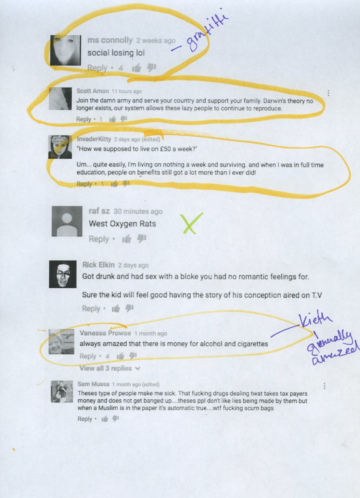
Here I decided to develop Keith's facial features. As a group, we all really like the textured lines that both me and Tess created in our early stages. I experimented with the positions of his eyes and also his nose shape. I really enjoyed developing Keith, but again I can find it difficult for me to show people, especially Jay and Tess.

Tess showed me how to use the Masking tool in photoshop because we are thinking about having just his suit Masked throughout the animation. I quite like the look of it, however I am quite forgetful and kept having to bother Tess about how to do it. I practised the process a few more times but still couldn't get the hang of it.


Because I'm not very good at using drawing tablets, I decided to try and develop my skills by drawing over the sketches I had created of Keith. You can blatantly tell which one I drew over and which ones I free handed, which gave me some really weird looking Keith's, however they also made me realise how much better he looks with even eyes as well as having them quite oval in shape.


I created a couple more sketches of what his face might look like from the side. This is where I decided I really want his pout to only come out when he is facing to the left or right. I think this could be hilarious and really make him come across as vain and ridiculous.

Here, I added colour and also experimented with colours. I really like the various colours that I used for the different lines. I also quite like how his face is just white, I feel like this would stand out against the colourful and textured backgrounds. I still think the hair on his head should just be black, as I think there's too much going on when his cheeks and nose are ink, as well as his outline being blue. Overall, I feel as though Keith is almost there looks wise.


 My next step is to finalise his designs as an individual, and as a group we are aiming to get our script done as soon as possible.