Sunday 17 January 2016

Visual Language - Study Task 2 - Captain Character - Brief Body Development

I finally decided on a face shape and a rough idea of where the features would be on the face. At this point I still was unhappy with the hair, which I chose to develop.

I started to experiment with certain facial expressions to decide whether or not I was fully happy with the characters design. I found that his design still didn't feel right compared to my character description. I decided to try the character with a tu-pay and with side-burns, however I felt that this still didn't really fit in with the character. 

I feel as though in these drawings, I didn't fully take into account gravity. I feel as though certain aspects and features of him should have a drag to them. This is something I will research and apply to my character.

My next step to develop my character into a final design is to experiment with longer hair and extremes of facial features in order to decide what looks better.

At the bottom of the sheet I decided that the body shape was perfect apart from the position of the legs when viewed from the side. I decided the legs need to be more central in order to take into account how he would move and how gravity would work with the character. I want my character to have a sturdy structure to him, without being too angular, and maintaining his round and soft shape.

Visual Language - Study Task 2 - Captain Character - Face shapes


This design sheet demonstrates my thought process of how I wanted my characters head to look. I started off on basic shapes, mainly focusing on round, soft edged shapes in order to fit in with my characters personality and with the shape of the body.
With shapes like the pear and the circle shaped heads, I found them to be too complex, and didn't fit the idea of my character. I feel as though the completely round head would be too generic, and lead the character to looking too simple. I also felt that the pear-shape would create more of a personality for my character, and also make him look a bit more realistic than what I wanted him to look.


Here, you can tell that I decided that my character would definitely have small glasses in order to fit in with his nerdy disposition. I started to develop and incorporate other features such as ears, nose and mouth. I used this 1/4 angle so I could experiment with the positions and shapes of his features clearly and demonstrate the placements of facial features all over the face.


Here I started to narrow down the shape and dimensions of my characters face. I found that some of the faces look familiar and quite generic. I want my character to look simple and boring, but still unique. I enjoyed experimenting with the extremes of the character such as the angry eyes and the large ears. Through this constant trial and error routine, I was able to figure out what features suited my character and how pleasing they looked to me and also what features and shapes need work on.


This sheet clearly demonstrates the finalisation of my character's face shape. I start to draw the character in the relatively similar face shape. In the top left corner, I created a clear drawing of my character's face, with his body. Even though I feel that this image is true to the character description, I still feel that my character needs further development in order to fully capture my characters description and personality.

I feel that the body needs to be larger, and more slouched. I also feel that the head needs more developed features such as the hair and the position of the features in order to dumb down and age the character to fit in with my description. He is meant to be a simple character with a dull but content life, and I feel like giving the character relatively normal hair indicates a more well-rounded person, which is the opposite to what I want.

Visual Language - Study Task 2 - Captain Character - Basic body shapes


Here I created various body shapes using basic geometric shapes. Because I wanted my character to be round and plump, I stuck to using spherical shapes. I feel that I quickly captured a rough visual shape of my character through the use of basic shapes.

In the image on the right, you can see that in the top right corner that I attempted to introduce rectangular shapes into the design. Straight away you can see a change in the look of the character. I decided that this square shape wasn't right, and didn't fully fit into the look of the character. My aim is to create a round and plump character to fit in with his unhealthy and lazy lifestyle.

I want my character to have bad posture due to the fact he works in an office, which is achievable by using spherical shapes, and the position of the head, which is demonstrated in the image on the left. With the placement of the two circles that make up the body I was able to create a slouched body shape. By having the bottom circle larger, and placed more forward against the shoulder and back circle, I was able to create the lazy vibe that I want my character to have.

When it comes to limbs, it is clear that I went from one extreme to the next. I initially used long, rounded shapes as the arms and legs. Personally I felt as though this made my character look too bulky. I wanted a perfect mix of round, large features as well as small features in order to fit in with his facial features. With this in mind, I decided to go in the opposite direction by drawing his limbs using thin, pointed shapes, which is presented in the image on the right. I feel as though these are key features in my character.

I understand the importance of experimenting with shapes when initially designing a character. I understand that using sharp, angular shapes can shift the look of a character and reflect on their personality. With this in mind, I have decided to stick with the circles for the base of my character.

Visual Langueage - Study Task 2 - Captain Character - Character Description Sheet


This is my character description sheet. When creating this, the visual image of my character started to take shape in my mind. The traits I had given affected the image in my head. My aim was to create a character that was strange and had something about him that wasn't quite right, but with a certain amusing charm. 

My next step is to experiment with body shapes in order to create a brief outline of my characters dimensions. 

Friday 15 January 2016

Studio brief 1 - Process and Production - The hat Inspiration


The hat Animation is probably the main inspiration behind my animation. I wanted to create a sketchy and rough animation that also had a flowing feel. I also wanted to express a look of hand drawn animation on paper.

in this animation by  Michèle Cournoyer, she creates a rough and messy look by manipulating paint and paper. I hope to achieve a similar look through photoshop.

Studio Brief 1 - Process and Production - Sand Animation

Sand animation is a practice that consists of a series of images created by an artist to create a feature of moving images. The process experiments with shadow as well as light.

Coraline Leaf is known for her sand animations. She takes the approach of placing sand on to a light box, and combining frame by frame animation in order to create moving images.


The manipulation of the textures allows for a gritty and messy feel to the animation.

Studio Brief 1 - Process and Production - Motion Capture

Motion capture in an animation process that records the movements of objects and people. In recent years, it has mainly been used to create feature films and games in order to capture moving actors successfully and precisely.


The advantages of Motion Capture is that it can successfully capture the speed and agility of an actor in order to clearly demonstrate real life. This process also allows many tests to be done in order to visualise how the end result will turn out. This is good compared to having to animate on a compute, without any reference for the system. 

Weight can be easily captured through this process too, which can be proved to be difficult when animating normally. 


The disadvantages to this process is that the cost to create a full length feature film using motion capture is extremely high. The software and equipment being the main source of money. Also, many of the principles of animation cannot be added until post-production. Theses principles include, squash and stretch and also anticipation. When these principles aren't considered, the animation and illusion can be hindered.

Studio Brief 1 - Process and Production - Octopus Storyboard


Here, I created a quick sketch of what I imagined my key shots to be. Even though I decided not to continue with this character design and ending, I still feel like this concept was strong. 

Studio brief 1 - Process and Production - The Other Side Storyboard Final


Here is my storyboard for my animation. I feel that I clearly demonstrate what I would like t o happen in my animation successfully. However I do feel that I should of added timing and spacing on each shot, but this proved to be difficult at the time as I was unsure about how long I wanted each shot. I also feel that I have successfully managed to capture the style that I was aiming for.

My next step is to create an animatic using colour and sound.

Thursday 14 January 2016

Studio Brief 1 - Process and Production - Rotoscoping


Rotoscoping is a technique where scenes are filmed, and then animation is composed over the top of it. Before modern technology evolved this technique, originally the moving film was projected onto a frosted glass sheet in order for the animator to work the cartoon around the scene.


This technique has been successful through the years, kick starting a new era of animation. However, it is a rare technique in the modern world, and is hard to come by in feature films. 

I feel that this process is a lot easier to experiment with from the creation of modern computer systems. I would like to think I would enjoy experimenting with this technique in a project if the opportunity presents itself.


Studio Brief 1 - Process and Production - Flip book Animation

Flip book animation is a simple and fairly easy way to create moving images. The classic flip book consists of paper and pen, but in recent years it has evolved into an even more creative practice.


Here, this artist instead of building on top of the paper, he has taken away in order to create optical illusions.


This is one of my favourite animations because it is a continuous movement of a humming bird using bright colours. This artist took the idea of the flip book, and modernised it to fit in with society. The human aspect is only played out through the drawing itself, and the actual moving of the paper is left to the machine. I really love the speed which the machine flips to paper to create this fast illusion of the bird hovering.

Studio Brief 1 - Process and production - Stop motion animation

Stop motion animation is a contemporary practice that usually involves a camera, and various materials to create objects and backgrounds in order to tell a story. Movement using this technique often varies depending on the style and experience of the Animator. The more fames and little movement between the frames, the smoother the movement when the clip is played back.


When stop motion first arrived, it was captured using film cameras instead of normal cameras. this proved to be difficult as the animator was unaware of how the animation looked until the film was processed. A key trouble when experimenting with stop motion is the fact that one small bump can completely ruin a scene.

Stop motion animation enables animators, character designers and set designers to create intricate and detailed features. The attention to detail in a lot of stop motion is fascinating because productions manage to create the illusion of depth and size using different materials.

Metal armatures are considered key when creating a character that will be animated. The metal skeleton is durable and stiff, yet easy to move which are important.


Nowadays, DSLRs are often used to capture stop motion animation because they are high- quality, and more efficient that using as video camera. These cameras make it possible to see what you're shooting straight after a couple of frames.


Stop motion animation is not only used to create feature films and TV shows, it is often used in advertisements and games. I hope to experiment further with stop motion, as it's one of the many animating practices that I enjoy.

Studio Brief 1 - Process and Production - Final Animation and Evaluation


Overall I feel that I have achieved a lot during the production of my animation. I feel as though I can successfully say that I have gained a lot of knowledge and understanding in my response to the brief.

I feel that I put a substantial amount of effort into the post production side of my project. I created a great understanding of the way I wanted my animation and characters to look like. I also feel that I documented this part of my project fairly well, which is an aspect that I wanted to work on from my last project.

I initially found it difficult to draw using a tablet, and use Photoshop to animate. I haven't had a lot of experience with both, so I decided to use this brief as an excuse to learn a lot about these techniques. Initially I found it difficult to draw using a tablet because I was constantly switching between different tablets. However I feel as though I have gained a lot of experience with drawing using a tablet in Photoshop.

I feel that my final animation resonates the style that I was aiming for. The limited colour palette and sketchy lines is what I was comfortable with, and also enjoyed the look of in other animations. Even though I was heavily influenced by various Animations and pieces of artwork, I have a sense that I have accomplished a personal style within my animation.

Backgrounds are something I definitely want to work on in the future. Even though I wanted my background to be simple, I still feel that a lot of work could of been done to create more of an atmosphere.

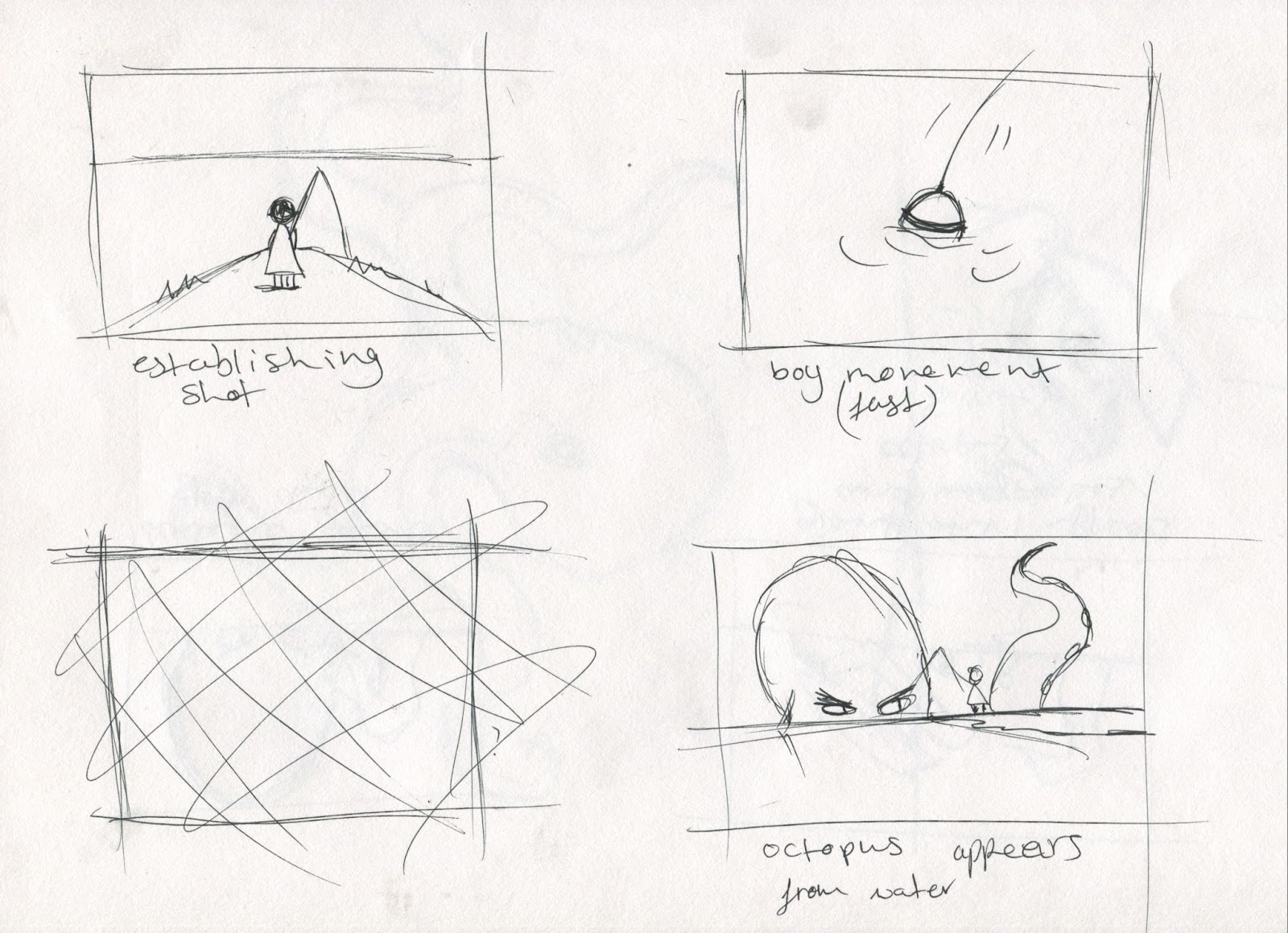
The most difficult thing I found when creating this animation, was the opening scene where the lure is bobbing up and down and then the fish comes along. I had to re-do that scene about 5 times as I was really unhappy with how it turned out each time. I still feel disappointed about how the shot turned out. If I was to re-do the scene again, I would definitely try to reference materials and real life in order to mimic them in the shot. However, this could prove to be difficult as the style I was aiming for is quite abstract.

I am also very unhappy about the end shot, where the fish sinks down into the sea, and his "dorsal ray" flies up into the air and sinks with him. I feel like a lot more frames and movement could of gone into the dorsal ray to successfully convey the weight and elasticity.

I feel that I was a lot more successful with time management with this project. I spent about two weeks designing the character and researching into colours and designs. It then took me a few days to get used to using a tablet, and then about 2 weeks to create the animation itself. I then spent about a week perfecting shots and making sure that everything was consistent. It then took a few hours to find and add sound. Next time, I would like to create my own sound.

The part of my animation where I had the fish coming up and out of the water was the most difficult. I wanted the movement to be smooth and precise. Even though I managed to achieve this, I still felt like the time I had spent on it hindered the progress of the rest of my animation.

When adding sound to my animation, I used Premier. I found this to be easy and quick to understand as I am still learning different programmes.

Overall, I feel that my animation and the production that had gone into it was successful and have taught me useful skills that can be applied into future projects. However, I do feel that I could of added a lot more movement if I hadn't focused mainly on the fish coming out of the water so much.

Studio Brief 1 - Artist Research - Process and Production


This is the main piece of work that I will refer to constantly throughout creating my animation. My aim is to createan animation that resonates this scratchy, rough style. I will do this through a series of using various brush strokes as well as drawing the frames with speed to create an expressive feel. I will also keep the colour palette limited to very few shades.


This is also a piece I will refer to throughout my animating process as I feel that the style of this piece is heavily influential to my own personal style within this project. My aim is create a style that I feel comfortable and able to create using Photoshop.


Studio brief 1 - The Other Side - Process and production - Process

I decided to explain my reasons behind my decision making and what tools went into the production of my final animation.


This is a screen shot of one of the two characters of my animation. I decided to keep my colour palette limited, as I wanted a simple but effective look to my animation. I made the background blue to represent the sky behind the character.

I decided to have a shaky look to my animation by drawing a frame, then redrawing the frame using the onion skin setting. This helped me created a more precise drawing within the frame, but still achieving that shaky look.


When using the paintbrush tool, I decided to keep the "Flow" at about 70%. This proved to create a more fluid line, that helped me achieve the sketchy look I was aiming for. I feel that this setting improved my drawing skills in Photoshop drastically as I found it difficult to become accustom to drawing in Photoshop. 

I also kept the pen size at 1 when drawing large scale images to create the sketchy feel, and the I would use the pen at 5-6 to create stronger lines if needed.


Here is the first shot of the fishes appearance in my animation. I do feel like I achieved the scratchy and rough aestethic I was aiming for, however the consistency of my varies throughout the frames. Even though sometimes it isn't noticeable greatly, here, the focal point of the shot is hindered. My aim with this shot was to have the fish be the focal point, son I decided to take into account the rule of thrds in order to create a successful shot. However, the fish seems washed out against the pale blue background, and the lines used to create the Boy are a lot thicker that I expected.

Originally I decided to do this shot in 1's. However, when I switched from working on a PC to a MAC, this shot was far too quick. Even though my intention was to have the shot to be swift and quick, I still wanted to maintain a consistent frame rate throughout.
One of the main technical issues I came across was switching between tablets, as well as switching between PC's and MAC's. I found that the two tablets that I used for this project created different lines because of the texture, and the quality of the tablet. I also found that the quality and frame rate would swap between being right and completely wrong when I loaded my animation on a MAC from working on a PC.


Another technical issue I came across was my labels for my layers. I found it fairly easy at first to keep on top of naming each layer, however, because I was constantly duplicating layers and switching layers around, the process got extremely confusing. Next time that a project requires me to use Photoshop, I will definitely stick to labelling as I feel that I wasted a lot of time figuring out which layers where which.