Overall, I am happy with the progress we have made as a group. I feel like the project was quite ambitious so it is no surprise that it wasn't completed. I feel like this is down to the animatic being too long as well as the script. We do plan on working on this animation further for the exhibition and I am excited to complete the animation because I am confident that it will be successful.
Thursday 10 May 2018
Extended - final animation.
Overall, I am happy with the progress we have made as a group. I feel like the project was quite ambitious so it is no surprise that it wasn't completed. I feel like this is down to the animatic being too long as well as the script. We do plan on working on this animation further for the exhibition and I am excited to complete the animation because I am confident that it will be successful.
Wednesday 9 May 2018
Extended - Final scene - slo mo
Extended - my final scene
After Tess finished the storyboards, we split off scenes depending on our personal preference and strengths. I felt like my strengths would be be best put to use here because I enjoy character animation, and wanted to take inspiration from shows such as adventure time to create a dynamic set of movements that matched the characters dialogue.
Here is the first part of my animated scene. This scene would be from when the agents first discover Zorinas and Hazel Tubetube page. I wanted to take inspiration from the pointless jump cuts that vloggers use all the time and exaggerated movements and expressions.
Extended - YCN - Final
For the final designs for the Frontier lager brief, I decided to corporate the bright yellow of their logo into the designs.
I feel like this project was successful because I didn't go too complicated with the design side of things. I decided to keep to what was already out their from the company itself because I felt like nothing needed changing.
Extended - Study Task 2 - YCN - Research
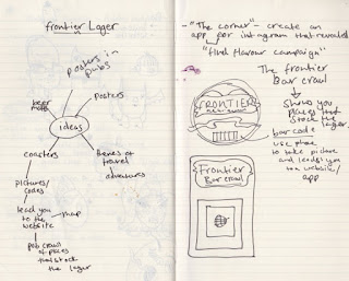
For the YCN brief, I decided to go with the Frontier lager brief that was to create an advertising concept for the company.
Here is me brainstorming ideas. the original idea was to create beer mats that had a barcode on it that you could take a picture of and it would direct you to a website that showed you pubs and bars that supplied Frontier Lager, to fit with their adventurous standpoint.
Here I foudn out that they had already done something similar that involved editing a photo using instagram to see what the posters hidden message was.

This has caused me to alter my idea. I have decided to design an app that would show you a map of where Frontier Lager is stocked rather than use the camera on the phone.
my next step is to translate my design into photoshop with meg.
Extended - Final characters
Here, I decided to experiment with my characters colours and textures after recieving feedback on my style tests.
I experimented with adding filters and grains over the top of the character to try and give it the grainy texture that I had when I used watercolour on paper.
Here I tried using darker, deeper colours, but I prefer how she looks in blue and green tones.
Here, I added a pastel shade over the top to add a grainy texture to the overall outfit.
For a scene in the animation, Zorina is vlogging and Hazel comes in in her pj's to scold Zorina.
I decided to give her rabbit slippers that have a similar nose to her.
Here i tried to give her pastel stripes on her pj's but I feel like the outfit looks better black.
Here is my final pj outfit design, I added a texture/grain over the top to make the outfit fit in with the other outfit that the character wears.
Here, I digitalised an outfit design that I had done early on in the project.
For Zorina, I experimented with opacity of the colours more because I wanted her outfits to match the background of her room.
Final outfit designs.
Here are my final character sheets.
Expression sheets.
Me and tess are the main animators for the project. We decided to take on a straight ahead animation approach because thats what we feel more comfortable doing and we appreciate the overall look and movement of straight ahead animation.
Extended - Characters in backgrounds
Here, Tess experimented with the different characters I created in order to see which style fit best with the backgrounds she created, as we were unsure which direction I should go in when finalising them.
Overall, I feel like I'm heading in the right direction with the designs.
Extended - Style tests
Here I created a style test for Hazel. I decided to give her green her, however her hair will change constantly throughout the animation because the vlogs would be filmed at different points.
I liked the wobble that the lines created, and I feel like I successfully captured the aesthetic I was aiming for digitally.
This is the style test for Zorina. I decided to keep her style quite loose, but also similar to what I accomplished with Hazel.
Extended - Character Designs
Here I decided to create some initial sketches of the two characters for the animation. I took into account the specifics that I had set myself.
Character Aesthetics:
- Sketchy
- Mixed Media vibe - pastels, watercolour, textured backgrounds.
- True to the descriptions. Zorina - Colourful, vibrant, well rounded. Hazel - Pretentious, Edgy, simplistic.
- Distinctive style
Hazel
For hazel, I took inspiration from images found on tumblr and pinterest. I wanted to mainly focus on creating a unique looking character using a style that isn't usually associated with character designs. I wanted to keep her sketchy at first, and then develop her into a clearer character as development went on.
I decided early on that she would have a short fringe, large leaver boots, distinctive eyebrows and quite a slender looking body in order to juxtapose her against Zorina. I experimented with her having glasses but I feel like they didn't look right.
I decided to switch to using watercolour and fineliner in order to experiment and establish an aesthetic. This helped me invision how I wanted her to look. I wanted to create characters that weren't necessarily conventionally pretty, so I experimented with bags under the eyes, redness in the cheeks and nose as well as spots in some places.
The textures that I created in these early designs were something that we definitely want to translate into our digital 2D animation.
Further Development.
I decided to experiment with cutout design in order to capture the angular structure of Hazel.
Here I experimented witht he underlaying structure and design of Hazel. I found this gave her a well-rounded appearance which was something we weren't aiming for. so I went back to using simpler shapes and used an illustrative stand point.
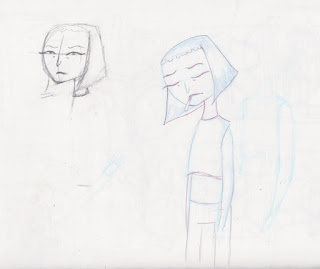
Here I experimented with how her mouth would move as well as some facial expressions. I was unhappy with how her face looked because it looked too conventional and pretty.
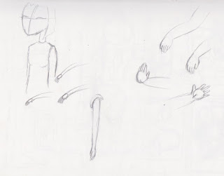
Here I briefly looked at how the characters hands would move and form. I want hazel to be quite angular, and her arms and legs to be straight lines, and I really dislike the idea of giving her a realistic like body.
Here, was a design I created that both Tess and Meg like, so I decided to pursue this sort of design in my finalitation.
Here, I used pencil and black ink to create some ideas for outfits and how she would look with colour. These seem to fit what I was aiming for. We want the characters to have a wobbly texture, reminiscent of Rhubarb and Custard, as well as Manivald.
Zorina.
I wanted Zorina to be quite a chubby and rounded character to fit with her description. Because she's supposed to be quite a quirky and expressive character, so I focused on creating a more detailed character compared to Hazel, but still have them be coherent in the world together.
These were the first images I created for Zorina. I wanted her to have a round face, and some redness in her cheeks, as well as large eyebrows for her expressions to be exaggerated with. The colours I used are quite muted, and I wanted the watercolour to be messy and smudgy but overlayed with thin black lines to define the character.
Here, I decided to experiment with a monobrow because I wanted the characters to have unconventional features about them. Instead I decided to give her large, round ears, large bushy eyebrows and small bags under her eyes.
Here was where I started to finalise the character. Her face needs to be a little bit chubbier so I decided to add more definition to her chin.
Here, I took inspiration from my moodboards of Zorinas outfits to create some well-rounded character concepts. I gave her a more defined chin, as well as a modern hippie, relaxed style.
I wanted Zorina to look more clean that Hazels designs to try and juxtapose the two characters, but keeping the watercolour type base in order to keep them coherent. 

These were my final concept designs for Hazel and Zorina, I went back and decided to redesign their faces a little bit. I wanted hazels face to look more angular, so I went back to her having a pointed nose that connected to her eyebrows.
Here are my finalised turnarounds. My next step is to successfully translate the characters into photoshop using brushes that resemble ink and watercolour like my initial designs.
Style Tests.

Here, I experimented with brushes that I've used before to create similar grainy and watercolour sketches before. I also created a watercolour sheet that contained colours that would be associated with Hazel.
Here I started to finalise the character further. I prefer the look of having a thick black outline that's quite rough and gestural, and having a textured watercolour base.
Again, I decided to create a watercolour sheet with various colours that I could use when colouring my character.
I used the inspiration from the mood boards I created, as well as incorporating textured and mixed media backgrounds that I had created for this purpose.
Here I found it difficult for her clothes and hair to be both brown because it ended up looking really muddy.
Overall, I feel like I'm going in the right direction with my designs. My next step is to create some style tests with slight movement in order to see if the style translates well.
Subscribe to:
Posts (Atom)


