Thursday 29 October 2015

Studio Brief 4 - Apply - Initial Idea's


Here, I brainstormed my initial ideas. I tried to think of ideas that were simple, and didn't require too much time as the deadline for this project is in two weeks. I knew from the start that I wanted to Hand draw my animation as I feel like it would be the most comfortable and accurate way to do it, personally. I plan on using animation paper that would take about 60 sheets.

 
I chose two main ideas that I was drawn to. My first idea was about a little fish that swam too deep into the depths of the ocean and encountered scary, and fearful creatures. I had an image of what these creatures would look like. I would have their skeleton visible through their skin. The colours of the outlines would be neon against a black background and I would create this piece using Photoshop and a drawing tablet. 

Here are 3 of my initial images. When creating these images I used deep see creature reference Photographs to help me understand the shape and colour of fishes. On the right I referenced an image of a fish skeleton and then drew around it to give he impression of skin around the edge of the fish. If I was to progress on this idea I would make the skeleton neon colours and have the fishes move sharply, and fast.

I decided not to develop this concept further because I felt that the standard of drawings that I wanted was far too high, considering  I only have another week to complete this project. I also felt like I wouldn't be satisfied if I simplified the storyline and the character design.


Here I explored my second idea centred around a Zombie, with a balloon that bursts suddenly in its face. The theme that I would focus on is surprise. My aim would be to create a short, but funny animation lasting about 5-8 seconds. I would again use hand-drawn animation to create this.
I eventually decided to pursue this idea. I believe that it was simple enough to create given the time frame, but could still be effective and gave me space to experiment.


Here, I created initial drawings of what I wanted my character to look like. I like the idea of black lines, as well as the dull green colours. I had the thought of him wearing a party hat and a suit to add to the comical effect that I wanted to achieve. I liked how on a few sketches, he looked goofy and silly. I decided to explore my character further.


Here I experimented and developed my initial drawings further. On the left I initially sketched a skull, then drew over the top to create a zombie-like face. However, I didn't like the look of this because it wasn't goofy looking enough, so I reverted back to my initial sketches and developed them. I really like the look of the zombie at the bottom right. To me, he's the right amount of dopey and slightly cute because of his comically silly sized party hat and his slight smile towards the balloon.

My next step in developing my character and creating my final animation is to create a series of drawings developing my characters expressions, focusing mainly on his resting face and his exaggerated surprised facial expressions. I will also start creating an initial storyboard of camera shots and notes that include sound, panning angles and lighting.


Wednesday 28 October 2015

Studio Brief 3 - Explore - Pendulum/ pose-to-pose


This is my finished Pendulum/Pose to pose animation.

I think that I could of worked on making the ball more consistent in shape and the action steady. I should of focused on making the pendulum look like it had weight by emphasising the anticipation of the swing, through slow movement and more frames at certain points.

I also feel like I could of worked more on the size, and making the pendulum look more 3D and less flat.

Overall, I found this exercise helpful in understand how Pose-to-Pose animation can be used to create initial ideas in order to create more of an idea of how the animation will look. It was also a good exercise in developing The 12 Principles of Animation.

Friday 23 October 2015

Studio Brief 3 - Explore - Squash and Stretch Practice (Flippin' 'eck)


This was my first try at making a ball bounce using a flip book. I ended up sticking two flip books together because I didn't think through how long it would take me to make a full cycle of the ball bouncing. I found the finish result to be okay for my first try. I decided I needed to work on creating speed, and further squashing and stretching the ball.


Here is my second attempt.  I made the flip book shorter, faster and used less frames. I think I made the ball a lot more life-like, in the sense that the ball squashes and stretches a lot nicer than my first attempt. However the ball seems to be quite flat, and hard in the flip-book. This is because I didn't exagerate the squash and stretch principle.


This was my final experimentation with squashing and stretching the ball. Here I decided to exagerrate the form of the ball in order to communicate the rubber texture of the ball. I made the frames fewr, in order to give a rapid motion to the ball, and to impact the overall action.


Overall, I found this exercise benefitial, and I feel like I have an understanding on the 12 principles of animations through this basic task.


Thursday 15 October 2015

Studio Brief 2- Nursery Rhyme - Final Story board

Here is my completed Storyboard.


I decided on a style that was clear and not too time consuming to create. I managed to communicate dimensions and angles fairly well by using squares and motion lines. I decided to use an orange pen to clearly demonstrate objects moving as well as camera panning.

I feel that I clearly demonstrated an understanding on the importance of camera angles to create atmosphere. A good example of this is when I used a vertigo shot to communicate a feel of dread from the characters perspective. I also demonstrated a sense of terror by using extreme close ups of the scared babies face.

Overall, I think that my storyboard was successful for my first attempt at creating one. I demonstrated an understanding of creating clear instructions within the shots as well as adding clear notes for people to clearly decipher.

Studio Brief 2 - Nursery Rhyme Story board - Development Process


After reviewing my initial post-it note Storyboard, I decided to develop, in detail, two shots that I wasn't happy with.


Here are the two shots that I developed first. I wasn't happy with how the tree looked initially, because it didn't really fit in with the overall style of the story board. I developed the tree by looking at various reference photos of twisted, baron trees. I was happy with the look, however I wanted the scenery to be more clear.

The second shot that I developed was the first shot of the baby swaying in the tree. I added black ink to make the image clear, and fully show what would be happening. I feel like I successfully created dimension, direction and perspective in this drawing. I made the camera angle more clear by adding a large arrow, that fits in with the dimension of the shot to add more perspective.


I wasn't happy with how I drew the branch snapping, so on the left, I re-drew the branch using reference photos again. I managed to add tension using shading and action lines. I preferred my ink drawing because it was more clear.

Because I liked the back ink, I redrew more shots and used a fine liner to define the lines further. I was happy with how the black ink looked initially, however the lines and pictures started to look messy, so i was undecided on if I would use black ink or not in my final story board.


Here, I developed my style further by doing brief character design. I refered to artists and cartoons that I had previously looked at, for example, the detailed gruesome shots from Ren and Stimpy and Mike Ploog's style in his storyboards. 

on the right, I went in the different direction with my style. I designed the baby to be more simplistic and less detailed. I decided to stick with this in my final storyboard to add to the weird style that I was aiming for.


Here I roughly redrew some shots further. The vertigo shot on the left was a lot better than my orignal because I centralised the image and clearly showed direction. I also redrew the shot of the bird looking over the baby, singing. I prefer this shot so I will use this one for my final story board.


Here I redrew the final few shots. I decided to add more of a comical vibe to this part, which in turn led me to adding more shots. These are very rough shots, however they were clear to me, and translated my idea well for further development.

Over all, I found my development extremely helpful in working towards my final storyboard.

Studio Brief 1 - Limbo video game - Playdead


Limbo is a side-scroller, puzzle-platform based game created by independent game developer Playdead. The game is based around a boy, lost in a state between Heaven and Hell, what people call "Limbo". 

When playing the game, you get overcome with a sense of tension, isolation and a strange feeling of not knowing what's lurking in the dark. 

I really appreciate the overall style of the game. The simplistic shapes, smooth movements and the fact that it's a 2D game (which you don't really see now) makes this game stand out against modern games.There's no dialogue, just sounds effects, which adds to the eerie, mysterious feel to the game and also carries the games plot. I feel like the main goal that was worked towards when creating this game was to attempt to create something using less components that games of this era use. They seemed to of taken a step back, and created something that has a powerful atmosphere and visually interesting.   


Tuesday 13 October 2015

Studio Brief 1 - Ratatouille Tasting scene Animation


Over the weekend I decided to watch Ratatouille because I hadn't watched it for a while and I still didn't fully understand the hype that surrounded it at the time it was released. Personally, I think the style was quite generic, and a lot more could of gone into the overall design of the animation as a whole. Anyway, the only scene that stuck out to me was the scene were Remy tastes some cheese and a strawberry.

I found it really interesting how they visually depicted taste through animation and sound. The jazz style music creates a noisy feel to the visualisation of the taste, which in turn presents us with a sense that the food is strong in taste. The soft shapes created adds a sense of a smooth texture. Overall, I feel that this scene successfully depicts a sense of taste and texture, as well as presenting us with the fact that the character itself has a full awareness of taste.


Here, a different character tastes cheese and some sort of fruit as well. His experience is quite the opposite to Remy's. The colours and shapes are dull, the sounds are far apart and faded to create a sense of a dull taste on his pallet.


The first two clips led me to this one. These are the stand alone animations of the visualization of taste from the clips. I found this to be hypnotising and calming and it also makes me strangely hungry. The video says that their aim was to create an abstract visual representation of the taste of cheese and strawberry. To me I think they succeeded.

Studio Brief 2 - Rock a by baby initial Post-it-story board

Below is my initial post-it-note storyboard, for the Nursery Rhyme Rock-a-by-baby. When creating these, I always considered the camera angles and how I could show depth and direction in the small window.


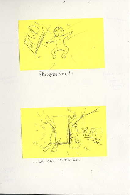
Here is my first initial idea for the opening shot. I enjoyed experimenting with the first few shots because of how I was able to create a sense of scenery. A lot of my notes on these initial sketches focussed on how messy the lines were, and questioning what style I was going to stick with because at first I didn't know whether I liked the look of having a sinister looking tree, and quite a simple, generic looking baby. I also felt like I needed to work on creating a sense of weight where the baby was on the tree branch and swaying.


On these two pages I continued the story. I found that overall, I needed to work on perspective, and a few of the shots. For example the bottom right corner sketch needed to be centralised, and further shadows and depth needed to be created to fully communicate the vertigo shot. I also introduce the first detailed close up of the babies face, that expresses the first shock and confusion of the initial snapping sound of the branch.


Here, I continue with the theme of the detailed, gruesome close up of the baby expressing terror. I also continue to show movement and direction using rough arrows.


Here are my last two shots. In the one on the top, it is obvious that I needed to develop perspective, and detail.

I included arrows and sounds to give a sense of movement and life. Because these were such quick sketches, i didn't have much of a chance to create detailed images.

After creating these, I stuck them in my sketchbook so I could annotate and analyse each window so I could see how much development I needed, and what I needed to concentrate on.

I decided that I needed to work on creating a sense of surroundings by including backgrounds, which is shown in my later concept sketches. I also felt that I needed to work on the branch snapping, because I drew the image off the top of my head and didn't use reference photos.

Studio Brief 1 - Identify - Your face by Bill Plympton Animation


After reviewing the 12 principles of animation,this animation in particular came to mind. Bill Plymton clearly presents the idea of squashing and stretching to depict texture, fluidity as well as dimention. It's a really unusual short, but its really inspiring and hypnotising. 

Personally I feel that Plympton's aim behind this short was to experiment and successfully demonstrate fluid movements, dimensions and distortion. He manages to create slow and distinctive transitions from shape to shape using detailed hand-drawn animation, which is really fascinating to me. 

The song the animation is paired to is obviously important. The song is originally sounds like it is sung by a woman, however in Plympton's animation, the song is slowed down to make the vocals sound like a man. The song is quite poetic in describing someone's beautiful features, which is juxtaposed by Plympton's visual interpretation of the musical tune and metaphors.

Overall I can see myself constantly referencing this piece when starting my own animations because it contains the 12 principles of animation, most notably the Squash and Stretch principle which is strongly demonstrated throughout.

Thursday 8 October 2015

Studio Brief 1 - Identify - Street of Crocodiles Animation


Street of crocodiles is probably one of my favourite animations. The Brothers Quay use a mixture of live-action, puppetry and stop-frame animation to create this captivating and dark piece.

Although at times, it can be quite repulsive and terrifying, I find this piece mesmerising and inspirational. The sense of uneasiness and curiosity is powerfully felt through the actions of The Puppet as well as the dysfunctional and fluctuating musical score. The camera angles challenge you to look further into what the shots have to offer, due to the long close-ups and slow focusing shots. No matter how many times I have watched this, I still feel like it goes on for a lot longer than it does. I feel like this is due to the eerie music, gradual build up and the cautious way the characters move.

The brothers Quay skilfully bring, not only the puppets to life, but screws, slabs of meat and pins. This to me is fascinating, because of how delicate they can make clunky, heavy objects into dainty, lively beings. I feel like this duo challenged the way people perceived animation and films as a whole with this significant style and alternative approach to atmosphere and metaphors.


The mechanical vibe from this piece stands out a lot, with the use of rusty, aged machines, screws and various more found objects compiled together to create characters . Overall, I feel The Brothers Quay took a simple idea of a puppet being cut loose to explore a dystopia, and created something with a grimy, creepy and almost tragic atmosphere that has stayed with me for years. 

Studio Brief 2 - Telling Stories - Bob Camp Storyboard Artist

Bob Camp Storyboard for Ren and Stimpy.


I decided to look at Bob Camp because his storyboards are clear and clean, which is a contrast agiainst the other storyboard artists that I have looked at such as Ridley Scott and Mike Ploog. Scott and Ploog create images that have a lot of depth and often colour, whereas Bob Camp creates quick sketches to depict the characters actions.


His quick sketches are accompanied by short sentences about the actions that fits in with what is going on. Camp clearly demonstrates action through motion arrows and visual representations of sound. The way that a lot of the animators that worked on Ren and Stimpy back then was act out each sequence, and document the actions within the storyboard to correctly depict movement for the cartoons, which is successfully done in these examples created by Bob Camp.

Overall, I find his storyboards interesting because he successfully captures motion and expression within the characters in a clean and precise way, without too much description to go along with the storyboard.


Studio Brief 2 - Telling Story - Ridley Scott Storyboard Artist

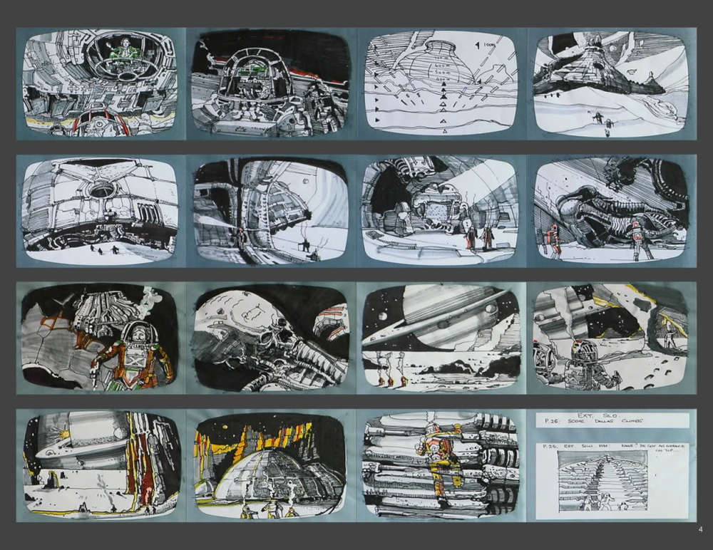
Ridley Scott Story board for Alien.

Ridley Scott took on the role of directing Alien in 1979, which is based around an aggressive creature designed by Swiss artist H.R Giger, who managed to create a swift, angular extraterrestrial being that was dark and equally terrifying. Ridley Scott not only directed the feature, but also created the storyboards for Alien.


I decided to research these storyboard not only because I am an fan of the franchise, but also because of how detailed and stylized Scott's storyboards are. They manage to create a sense of depth and emptiness which to me is incredible considering the limiting size of a storyboard thumb nail.

The camera angles are simple and enable Scott to show what's going on within the shot, which seemed to of translated quite well because there are a lot of similarities between the storyboard and the film. Throughout Scott's storyboard, he experiments with light and dark to portray the deep darkness of space and the isolation that is prominent in the film.

The only element that I haven't seen within Scott's storyboards that I have in a lot of storyboards,  is the demonstration of action and movement using arrows or notes. In some of the shots you have to sort of assume that there's movement based on life within the image. In the storyboard below you can sense the aggressive movements from the blood splatters and the chaotic sense within the picture. I think that this is quite hard to achieve when starting out drawing storyboards because the kinds of movements that Ridley Scott is trying to depict are difficult to portray at first.


Ridley Scott tends to use single words to describe what's going on within the scene. For example in the one pictured above he uses the word "mess" which accurately depicts the scenes atmosphere and chaos.

Overall I feel that Ridley Scott created a successful story board because he managed to show action, isolation and perspective within his drawings.

Sunday 4 October 2015

Srudio Brief 2 - Telling stories - Mike Ploog Storyboard Artist


Mike Ploog was the initial story-board designer for the movie "The Thing" which is one of my favourite films.

Ploog manages to create life and motion within his storyboards by using angles, shadows and a sense of motion from the characters. He tends to use arrows that become part of the detailed sketches themselves. Mike Ploog also manages to create depth and surroundings through the detail he put into creating backgrounds for the characters to play off.

From the looks of things, he did an excellent job translating the script into visual, dramatic and detailed shots for the production crew to work off. Ploog presents extremely clear instructions within his story-boards, which obviously helped the production crew of the film because if you compare the storyboards to the shots in the movie, you can see a clear comparison. As proven here. As an avid fan of the movie, his style seemed to of inspired the aesthetic look of the overall film. He was heavily involved in the making of the film, most notably the storyboard starting point.


Overall, I particularly enjoy his storyboards mainly because they are drastically different to the typical cartoon style that is usually associated with storyboards, which is mainly down to his personal style and also because the storyboard was for a film. Ploog's contain great detail and shading to portray a theatrical vibe, and as stand alone pieces, they could be classed as a work of art.