I decides to use these colours because I feel like they contrast against the colour I initially wanted my fish. From this style sheet however, I have decided I definitely wont be using block colour within my animation. I personally don't like the style, and would like to keep the look of my animation sketchy and messy. I also feel like block colour is something I would like to leave to experiment with in a different project, as I feel that the time I have with this animation is fairly limited if I wanted to add the amount of colour that I would of wanted to.
I decided to create concept art for my fish creature using Photoshop.
My aim is to create a large, angry looking fish, that has some funny attributes.
Here is a design I did for the large fish coming out of the water to eat the boy. I like how his eyes budge out. I feel that I will be able to get really creative with this shot, by having lots of movement coming from the fish.
Here, I experimented by drawing my fish with a dark green colour. I like how sketchy the drawing looks, which is the style I hope to perfect within my animation.
Overall, I feel that my initial character designs were successful. My next step is to completely perfect the image of the fish, and create a few shots of him in action.
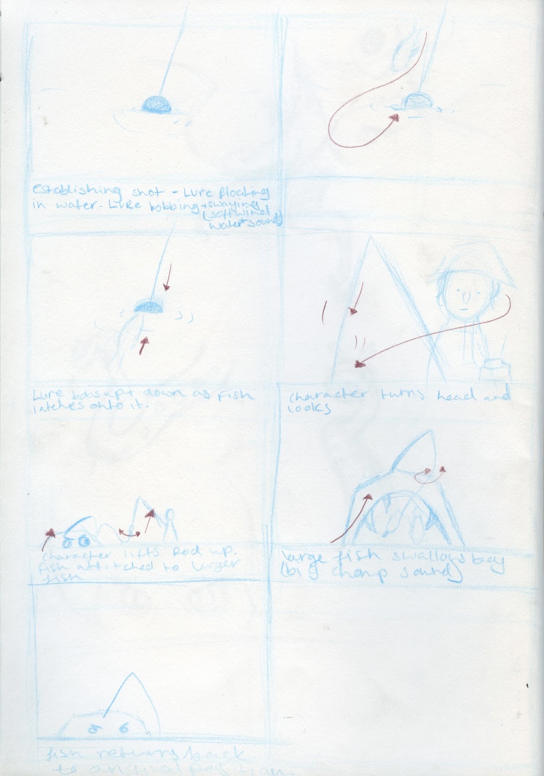
Here is my Animatic for my animation.
I feel that my Animatic is clear in demonstrating what is going on in each shot. I achieved this by using arrows, and sound.
For my first Animatic, I decided to use Adobe After Effects, as I haven't had enough experience with other programmes to create my Animatic in. I found the process easy to follow, however, I found creating my Animatic time consuming because I found it difficult to find sounds, and enable my understanding of timing.
My aim in my animation is to have a sketchy aesthetic, and a simple feel within my sounds and movement, to create a humorous feel throughout.
Overall, I think my animatic communicates what I want to happen in my animation, which is what I understand an animatic to be. If I was to create my animatic again, I would create my own sounds, rather than use ones on-line. However, I can experiment with this stage later on in my animation.
Here is my storyboard for my animation. I plan on re-creating my storyboard using Photoshop, so I didn't take a lot of time sketching it out. I think that my storyboard is clear in demonstrating what is going on within each shot.
My next step is to create further character designs and my Animatic, and also re-create this storyboard using photoshop in order to clearly demonstrate my animation and actions.
I used fine liners and a water colour paintbrush to create a wash of colour over my fish designs. I decided to revert back to my original idea after a brief talk with my tutor. This has caused me to refer back to my fish mood board, and create sketches.
On the left, I created two creepy looking drawings. I do like these drawings, however I feel that they're too detailed considering I want a sketchy feel to my animation. I also don't like how thin they look, I would prefer to have a larger looking fish, because it would give me more of a range to animate on. This led me to create the sketches on the right.
My next stage is to create my fish designs using Photoshop, and create a storyboard as well as an animatic.
Here are some initial sketches I did for my second character. The first sketch I did made him look too young, so I elongated his face in order to shift his appearance into looking older. I wanted his design to be simple and fairly easy to animate as I feel my other character, the fish, will prove to be time consuming.
My next step is to create more sketches using Photoshop for me to get used to the feel of drawing in Photoshop, and to finalise the overall look of my animation.
Here, I quickly sketched an image of an octopus, using a tablet and Photoshop, in order for me to get used to drawing in Photoshop. I do like the sketchy look that I created, however, I hope to work on my drawing skills as I found that I was slow with drawing this.
This is the first sketch that I did of my octopus character. My aim was to draw an octopus that was true to it's form, and anatomically correct to an extent.
This is a stylised drawing that I did using pencil and fine liners. I quite like the idea of having my animation in a sketchy sort of way, which is what I usually draw like. Personally, I think it would be difficult to adapt my style into a digital media like Photoshop, as I haven't had a lot of experience with drawing in Photoshop.
Here I did a few visual studies into the anatomy of an octopus.
Overall, I like my idea so far. However, I do think that my original idea was the strongest.
This was my first design for what I wanted one of the shots to look like. My idea is to have a shot of the boy fishing, and then have the camera pan underwater and reveal the large fish hiding under the water.
I decided to sketch out a few drawings of deep sea fish. I did this to gain an understanding of how I wanted my fish character to look. I feel comfortable using inks and water colour, then laying over a black fine liner. However, with this project I aim to push myself and experiment with the technical side of animation.
I then had an idea of having the fish be a large fish person. I decided not to pursue this idea further as I felt like it would be too complicated, and I want my animation and characters to be simple, but effective. i also feel that trying to animate this character would prove to be difficult.
When thinking about how I wanted my animation to end, I decided that I didn't like the idea of the boy being eaten at first. I decided that I wanted the fish to be an octopus, and have a large anvil fall on top of it's head. I would have this end my animation because it would give an abrupt ending and a comical feel.
This is my initial idea's mind map. When creating this mind map, I always referred to how I want my idea to be simple, but creative.
This was my first idea. I did an initial sketch of what one of my camera shots would look like. I would want the image to be constantly moving, and have the feeling of going inside of the images. I imagined the animation to flow swiftly, and have a journey throughout. My focus would be on the idea of hell, and have various symbols that represented different aspects of hell. I decided not to go with this idea, as it's quite a typical concept when thinking of hell.
My second idea centred around how large fish like whales and dolphins are treated. My aim was to create how it feels to be on the other side of the glass. I would have flashing lights, fingers pointing and people and children knocking on the glass to create a hectic feel. I would also emphasise the isolation that would accompany being in a small tank.
I decided not to continue with this idea, as I felt that I couldn't have made the animation stretch over the 25 second requirement.
Idea 3 was based around a long camera shot that panned down through the soil of a large space of land. Skelotons, worms and other underground creatures would be passed through the journey downward. The aim was to show the other side of the ground, and show what we don't see. I decided not to focus on this idea anymore because I couldn't think of an ending, and didn't feel confident animating a complicated shot.
Idea 4 was based around somebody dying, and changing forms in the afterlife. After the first death, the character would be re-incarnated into a dog, and then into a smaller animal and so on until finally being re-incarnated into an ant. I would of presented this in a sort of cycle.
Idea 5 was my final idea. I wanted to show the other side of the water. My idea was to have a character fishing, and seeing a small fish. Then the camera would pan under the water and reveal an extreme large, grotesque sea monster. The animation would end with the monster eventually coming out from the water and eating the person.
I have decided to pursue Idea 5 because I feel like I would have a lot of freedom to experiment, and explore different styles and techniques, as well as produce an animation that meets the brief requirements.
This is my finished Bouncing Ball that I animated using photoshop.
I found this process easy to understand and the finished resulted was okay, despite the time that went into it.
The ball I created seems to change shape, and is still quite sketchy. However, I feel like I successfully applied some of the 12 Principles of animation successfully. For example, I feel like I depicted the texture of the rubber ball well, by having the ball squash and stretch on impact, but the colour and shape of the ball could of been done better in order to stick with the illusion that it is a ball.
I think that I could of added a few more frames to make the animation smoother, and exaggerated the shape of the ball to emphasise the rubber texture.
Here is my initial style guide/moodboard. My aim with this was to create an idea of a colour scheme to work towards when creating my initial sketches. My next step is to create initial sketches and ideas referring to this colour scheme throughout.
From this project I feel like I have applied a lot of the techniques I have learned about from my seminars and research.
Personally I think that my animation turned out well. The storyboard I created at the start of the project heavily resembles my finished animation. My aim was to create something comical and simple. I decided to create this animation using a mixture of pose to pose and straight ahead animation. I did this to keep the look of the character, and make the process so I had certain frames to work towards.
I decided to add sound because in my Pixilation I didn't use sound. However, for some technical reason, when I reopened the file after saving it, the sound seemed to of become out of sync, and the animation is jumpy and misses a few frames. The music was meant to abruptly end when the balloon popped to add a comical vibe. The animation itself turned out to miss a few frames. I have learned that next time I will consult other people with more knowledge on how to export and save my files.
The research that I did into balloons popping helped me greatly in understanding the textures and weight of the balloon. However, I feel that I could of used a few more frames in between the balloon swaying to depict the lightness of the balloon.
I also think that I could of used different angles. Such as shots of the balloon close up, and character close ups. However, I feel like this would of taken away from the short, simple and comical feel I was aiming for.
Overall, I have learned a lot from this project. I feel comfortable with hand drawing my animations, however, transferring them into a playable animation has proven to be difficult and to have gone wrong.
Here is my first flip book that I created. I decided to base the ball inside of a box so I could visually see where the ball would be hitting the sides. This would prompt me to change the shape of the ball to emphasise the rubber texture.
Here, I decided to draw my bouncy ball without any lines for me to get more of an understanding of timing and spacing between points. I feel like out of both of the flip books, this was the more successful one because I demonstrated timing, spacing and texture.
I feel like for my first flip-book animation, they turned out okay. I took into account the 12 Principles of Animation throughout my drawing process to convey the texture and speed of the ball. However, I think I could of referred to the 12 principles of animations more during he process, as some of the frames lose the balls original shape.
Overall I feel like I gained an understanding on how the flip-book process can be useful. I can use this technique in my late projects to test out any movements that I wish to animate before taking the next step.
This stop-motion animated film, centres around a boy that has been living with creatures called The Boxtrolls his whole life.
The detail that had obviously gone into the set and character design is amazing. However I felt that the colours and some of the character's to be a detached from the film as a whole. The colour scheme consisted of brown and deep oranges, which fit the story well but I personally though the colours were plain.
The animation was created by Laika, who are known for creating animation in extensive attention to detail, storyline and set design.
The Yellow Submarine is an animated, musical comedy inspired by the music of The Beatles.
This animation stands out against a lot of animations, due to its strange, bright and psychedelic appearance. I particularly enjoy this film because of the adventure that the characters go on, and how strangely designs the characters are. The shape of the change constantly through the scenes, so I think the animators used straight ahead animation as their main process.
This animation has a dark and scary atmosphere from the start. The 2D style 3D animation gives a strange feel to the animation.
The short centres around the physical embodiment of death, and how his presence can send people crazy. I feel like this animation attempted to bring to light how society can have warped views towards death, and how these views can destroy society. The constant symbolisms of Christ throughout the animation may bring a deeper meaning behind their aim.
Overall, I really enjoy this animation, and can see myself referencing the style in later projects.
Here is my screen test for the last second of the animation.
I feel that the shaky look that I aimed for has been accomplished throughout every screen test I have done. However, in this screen test I used the extremes I made for the beginning, middle and end as a reference for these shots. If I was to redraw these frames, I would pay attention to the shape of his collar and head, as they tend to shift shape and size throughout a bit too much.
This is my screen test for Larry's balloon drooping after the drop. I feel as if the shaky look of my animation that I was aiming for has really shown through in these frames.
Personally, I think I achieved the look I was aiming for. I wanted the balloon to shakily droop down, and the characters eyes to follow and his expression to fall. One problem I have with this screen test is the fact that his eyes slowing and slightly get a bit bigger. This was an accident but I feel like it really adds to his own surprised expression.
My next step is to animation his arm falling to his side.
This is my screen test for Larry's balloon popping. I decided to do this to see if I needed to add more frames before continuing onto the next part of the balloon drooping.
I feel as though the balloon I created popping was fast enough to give the impression of the balloon popping, but enough frames so you can clearly see the separate stages. However, I feel like his facial expression could use some work. The frames between him smiling and starting to frown seem to be a rapid jump.
Here I created a screen test of Lenny and his balloon. I decided to do this so I could gain an understanding of what the opening scene of my animation would look like.
I started out by drawing my character Lenny for the first frame, with the balloon in the centre. I applied the techniques I learned from my brief that required me to create a pendulum, by creating key frames and then filling in the gaps. I drew a balloon on the far left, and far right and joined the frames up with in between frames.
So far, I feel as if this screen test has pushed me forward to create the rest of my animation as its given me the assurance that I needed to continue.
Here, I created a few quick sketches of my character Lenny. My aim for these sketches was to create an understanding and visually communicate his feeling of surprise. I wanted his expression of surprise to be like his original resting face, because I still wanted his silly, gaunt look to shine through his expression.
From studying the slow motion video of a balloon popping, I created sketched inspired by the texture, and transition. I initially created an extreme of what I wanted the balloon the end up like at the end of the bursting process. I found this helpful because then I had an image to work towards when developing the process.
This is what I want the balloon to look like when it fully droops down, and limply hangs off the side of Lenny's hand.
My next step is to create my initial test frames of my animation, and also develop the ending of my animation further as I haven't documented Lenny's arm moving off screen.
Here is my storyboard for my animation. I decided to do my storyboard quite sketchy as my animation isn't that detailed as I already have gotten the hang of drawing the character.
I decided to use one continuing shot, because of how short my animation will be. I predict that it will be a maximum of 8 seconds when I drew this. However, through further planning, I decided that the maximum it would be, without titles would be about 6-7 seconds. These times are all depending on how my animating of the balloon turns out.
My next step now that I have a clear understanding of my shot, is to start creating sketches of my extremes.
I decided to give my Zombie character a name, which will be Lenny. I will include his name in the title sequence.
Rob Mcallum is known for creating the storyboards for the film Hellboy.
I decided to look at this artist because his story boards are detailed, dark and involve good camera angles. Mcallum adds shadows in certain places to clearly demonstrate where light is coming from, and also creates a sense of perspective by briefly adding backgrounds. All these elements are used in a way to communicate to the production people how the angles and scenes should look.
Kris Muikai is know for his clear and concise storyboards for the well-known TV show, Adventure Time.
His storyboard clearly depict camera shots that relatively demonstrate the scene. Mukai uses action lines to create the illusion of speed, weight and timing. Because the style of the animation itself is simple, so is the storyboard design.
Frame by frame, or straight ahead animation, is a process usually used to animate fabrics, elements and objects that are affected by the main pose to pose animation.
This technique is used because some things can be difficult to animate using extremes. For example, like in this video, fire is difficult because it's unpredictable, and doesn't tend to stay a certain shape. Hair is also something that is difficult to animate due to how soft, and flowing hair is when movement is happening.
Overall, I think I will apply this technique throughout my future animations to help create a flow to certain elements.
Here, I found a video that fully explains pose to pose animation. I found this helpful because it explains the reasons why animators use this type of animation.
Personally, I tend to plan my project to an extend where I know what I'm aiming for. Pose to pose animation will be a process that I will definitely use when starting to animate an idea.
Fantastic Mr. Fox is a classic childrens book created by Roald Dahl, that was adapted into an animated feature film by Wes Anderson. The Animation was lead by Henry Selick, however when he left the project Mark Gustafson took over.
Typical of Anderson's work, the film follows a strict colour scheme that initially sets the vibe. The film is mainly stop-motion, with detailed characters and sets to tell the story. It constantly has this speedy, fast movements throughout from the characters, but at times on some of the close ups, you see the real detail. For example, there are certain scenes of the feature that have close-ups of the characters faces. Selick/Gustafon managed to portray a lot of emotion during these shots by creating small adjustments to the face to create smooth facial movements.
I decided to look at this video because it's interesting to see animations that use unusual materials. The animation was created by Geoff McFetridge, who etched stories onto pieces of toast, took pictures and looped them together. The animation accompanies the song really well, and has a great flow throughout. I found it interesting how there were many stories that linked together by travelling through the images themselves. The simplistic designs made the animation look clean and smooth. To me this piece is experimental. Using a medium that isn't really considered or related to animation makes for an interesting look, I may refer to this video later on in my course because I like the idea of moving through the images, and each images being connected.
Michael Gondry is known for creating unique music videos and also writing story's for feature films.
I decided to look into this video as it is a music by one of my favourite bands, and also because I've never seen a music video like this one. Gondry uses lego as a medium to create motion and scenes typically seen in a music video, using the process of stop motion.
The video has a sort of simplistic look about it. The limited colour scheme (which is typical of The White Stripes) as well as the fact that he used lego, which is available to pretty much anyone. Gondry managed to create smooth movements, even though a lot of the shots had to be de constructed and reconstructed throughout the whole filming process.
The only part that required a computer is between 1:20 and 1:24. Gondry managed to re-create the look and shape of Lego to fit in with the video, as well as add dimension.
Here I researched into Pixilation. I decided to chose this music video, because throughout it fully combines stop motion with Pixilation.
Pixilation is interesting for me because they involve humans, as well as different materials to express and explore the principles of animation. It's a playful piece that I really enjoy.
This Pixilation in particular, not only has a human reacting to objects, and other characters, but also has the object morphing to follow the lyrics.I found this element interesting and it will probably be something that I will explore in the future in one of my projects.
For my research into flip-book animation, I decided to look into Colibri by Juan Fontanive. He is an artist known for centring his work around humming birds.
Personally, I think that he has challenged the typical idea of what a flip book is by spreading the image over two pages, and creating a machine that mechanically moves the image instead of having the element of human interaction to create moving image.
Fontanive creates a smooth moving image, which clearly was extremely time consuming. The bright colours, and movement captures the image of the humming bird well. The starting point for flip-book animation is creating a simple moving image to fully understand the principles of animation, before moving onto more complicated flip-books like this one. I feel like I would be comfortable creating longer animations using flip-books if I was given the time, and opportunity to.
If I was to apply flip-book animation to one of my projects, I would probably use it for my initial animation. This would help me get more of a feel and see what my animation will look like.
I decided to post about my sketchbook as I think that I managed to clearly explain and demonstrate my ideas through sketches and documented thought processes.
On the left, I wrote the brief out. This usually helps me generate ideas because it is the beginning of me understanding what is being asked of me, what guidelines I need to follow and what deliverables are expected. On the right, is my initial mind map to help me generate ideas. I separated the categories and thought about what I associated with them categories.
On the left, I did some initial sketches and annotation of my first strong idea, which was centred around a baby inside of a woman's stomach, growing from a small ball. I had the idea of using plastercine as the medium for the baby as it is easy to mould. I showed a quick camera shot at the top of the image. I demonstrate that I wanted the stomach to be zoomed into, and then eventually focused on the baby.
On the right, I briefly demonstrate what the opening shot would of been. My idea was to have a woman walk into the shot, and stand in the centre ready for the zoom in shot. I also sketched out an idea of what I wanted the set for the inside of the stomach to look like. I was going to make a box that contained pink and purple fabric to symbolise the inside of the woman's stomach. I would of set a camera in front of the set to get the right angle.
Here was my second idea that I decided to explore. I wanted to focus on the generic idea of having the parasite being a piece of clothing, and the host being a human. The pixelation would of focused on the interaction between the two.
On the left, I analysed and thought through my third strong idea. On the right, I made two key shots that came to mind when reviewing my idea. I decided that this idea was the strongest. It would be based around the theme parasite and host. I would have the parasite crawling inside of the persons ear.
I decided to create a mind map to generate ideas and concepts of fear and nightmares. I then pinpointed certain ones that stood out most to me because of how interesting and how much room I would have to create something that I would be please with. I decided on using the fears suffocation, fire, sharp objects and growing old because they are all contrasting fears, but also common in people.
Overall, these few pages from my sketchbook have helped me with my idea development.
I decided to analyse this animation because its unique when compared to my usual taste, and what I have referred to in my previous posts.
I was drawn to this animation because the projection played throughout the video stands out against the dull scene. It focuses and experimented with the form of shadows, which play around in the room and tells a small story. The projected animation grows and covered the people, and brightens the room completely. I really enjoy the animation because of it's simplistic design, but also how effective it is when being projected onto a scene. I really enjoy how the projected animation flows through the room.
Here is my final Pixilation. I decided to focus on the idea of a parasite taking over a host in their sleep, and then having the host go through a series of nightmares; Suffocation, Fire, Sharp objects and Growing old, with eventual death.
Because a lot of the Pixelations that I looked at for inspiration involved clothes and usually household and common object. I decided to apply a few of these aspects into my own piece. I used my own materials found in my home, to give an abstract look. I used a black cardigan to demonstrate suffocation, and orange, yellow and red clothing to represent fire.
I feel that overall, my Pixilation was successful, however there is a lot that I could work on. One thing being sound. If I have a chance to come back to this piece, I would add ambient sounds over the images, to create a more dreamlike feel at the beginning. I then would switch to thunderous like sounds, to give a sense of rumbling and to symbolise the shift in tone. I would also add loud, cracking sounds to portray the fire, as I feel that the materials I used were too abstract and using sound effects would communicate the scene better.
I would also experiment with the lighting, and camera shots in my next Pixilation, as I felt like I had limited myself to one single camera shot throughout the whole piece. However, I feel like using one whole continuing shot, with one main focus, fit my Pixelation. When planning, it seemed like using more shots to establish what was happening would of proved to of been useless for what I was trying to portray. Overall, I feel like the certain camera angle I used throughout was perfect for my idea, but I will definitely experiment with camera angles further in my next animations.
In some of the scenes, there are some technical and visual errors. For example, sometimes the lighting shifts when it's not meant to, and the duvet that the person is lying on moves unintentionally. I also think that the transition to black at the end could of been dragged out further and become more gradual.
I would also add credits and a title. I am aware of how important these are, however I wasn't aware that it was something I should of considered.
Overall, the piece I produced resembles my original idea, as well as a lot of my sketches and my storyboard. I also think that I communicated my thought process well through sketches, Blog posts and annotation of my images.
The Life Aquatic with Steve Zissou is one of my favourite films. Having watched it again over the weekend, I decided to do further research into the film and write a quick analysis.
I am a big fan of Wes Anderson's films. They are vibrant, funny and overall aesthetically pleasing to me. One of the main things I enjoyed the most was the short animated parts of the film.
The animations were lead by animator Henry Selick. He is known for his vibrant and strange animations, and in this film he doesn't disappoint. Even though it is a live action film, the small segments of animation surprisingly fit the film and does not look out of place, which to me, gives the feature a charming feel. The seahorse that Zissou is given by a small fan at the beginning of the film is beautifully designed. The colours are vibrant and clear, and the stop-motion process produced a clear and 3D look.
Overall, I found that the stop-motion animations presented within this film are perfect, and I enjoy the idea of incorporating a completely different medium and process into a life action feature.
I decided to incorporate a small character into my sequence so it wasn't just a plain gif of a bouncing ball because I felt that I had experimented enough with trying to bounce a ball with my various flip books.
I feel that for my first self-drawn animation, that incorporated some of the 12 principles of animation, that the outcome was successful. I managed to keep the ball at the same sort of size, and communicate the soft, elastic texture of the ball.
If I was to re-do this gif, I would pay more attention to the shape of the ball in the last few frames of the animation, and make the colour of the ball more even within the shape.
Here, I found a video from Youtube as a reference for my Animation. In my Animation, I have a Balloon popping next to my character. I decided to research into balloons popping in slow-motion so I could gain an understanding of the breaking point of the balloon, and also the texture of the rubber after the air escapes.
I found the second half of the clip more helpful. The shape that the rubber takes is typical to what you would think, and personally, I think that it would be easier to communicate the texture of the balloon, within my animation. My next step is to create initial sketches and drawings of the balloon in the style of my animation, and work my characters reaction around the pop.
I decided to do some visual research into the concept artwork for the Laika Studios film, Paranorman. A lot of the concept art that I focused on was by the artist Heidi Smith. I was attracted to her artwork because of how rough and dark they were, and the appearance was the style that I was aiming for.
When designing my character, I didn't do research into reference photos or artists, which is what I do usually. Because this is my first hand-drawn animation that I created, I felt like I wanted to use my own style. However, I think in the future I will prefer to research into images to work off, but applying my own style.
From this research, I developed the style of my animation by deciding to keep my style rough, and dark. At this point however, I am still unsure whether I am going to use colour in my final animation.