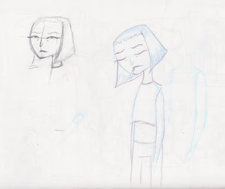
Here I decided to create some initial sketches of the two characters for the animation. I took into account the specifics that I had set myself.
Character Aesthetics:
- Sketchy
- Mixed Media vibe - pastels, watercolour, textured backgrounds.
- True to the descriptions. Zorina - Colourful, vibrant, well rounded. Hazel - Pretentious, Edgy, simplistic.
- Distinctive style
Hazel
For hazel, I took inspiration from images found on tumblr and pinterest. I wanted to mainly focus on creating a unique looking character using a style that isn't usually associated with character designs. I wanted to keep her sketchy at first, and then develop her into a clearer character as development went on.
I decided early on that she would have a short fringe, large leaver boots, distinctive eyebrows and quite a slender looking body in order to juxtapose her against Zorina. I experimented with her having glasses but I feel like they didn't look right.
I decided to switch to using watercolour and fineliner in order to experiment and establish an aesthetic. This helped me invision how I wanted her to look. I wanted to create characters that weren't necessarily conventionally pretty, so I experimented with bags under the eyes, redness in the cheeks and nose as well as spots in some places.
The textures that I created in these early designs were something that we definitely want to translate into our digital 2D animation.
Further Development.
I decided to experiment with cutout design in order to capture the angular structure of Hazel.
Here I experimented witht he underlaying structure and design of Hazel. I found this gave her a well-rounded appearance which was something we weren't aiming for. so I went back to using simpler shapes and used an illustrative stand point.
Here I experimented with how her mouth would move as well as some facial expressions. I was unhappy with how her face looked because it looked too conventional and pretty.
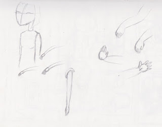
Here I briefly looked at how the characters hands would move and form. I want hazel to be quite angular, and her arms and legs to be straight lines, and I really dislike the idea of giving her a realistic like body.
Here, was a design I created that both Tess and Meg like, so I decided to pursue this sort of design in my finalitation.
Here, I used pencil and black ink to create some ideas for outfits and how she would look with colour. These seem to fit what I was aiming for. We want the characters to have a wobbly texture, reminiscent of Rhubarb and Custard, as well as Manivald.
Zorina.
I wanted Zorina to be quite a chubby and rounded character to fit with her description. Because she's supposed to be quite a quirky and expressive character, so I focused on creating a more detailed character compared to Hazel, but still have them be coherent in the world together.
These were the first images I created for Zorina. I wanted her to have a round face, and some redness in her cheeks, as well as large eyebrows for her expressions to be exaggerated with. The colours I used are quite muted, and I wanted the watercolour to be messy and smudgy but overlayed with thin black lines to define the character.
Here, I decided to experiment with a monobrow because I wanted the characters to have unconventional features about them. Instead I decided to give her large, round ears, large bushy eyebrows and small bags under her eyes.
Here was where I started to finalise the character. Her face needs to be a little bit chubbier so I decided to add more definition to her chin.
Here, I took inspiration from my moodboards of Zorinas outfits to create some well-rounded character concepts. I gave her a more defined chin, as well as a modern hippie, relaxed style.
I wanted Zorina to look more clean that Hazels designs to try and juxtapose the two characters, but keeping the watercolour type base in order to keep them coherent. 

These were my final concept designs for Hazel and Zorina, I went back and decided to redesign their faces a little bit. I wanted hazels face to look more angular, so I went back to her having a pointed nose that connected to her eyebrows.
Here are my finalised turnarounds. My next step is to successfully translate the characters into photoshop using brushes that resemble ink and watercolour like my initial designs.
Style Tests.

Here, I experimented with brushes that I've used before to create similar grainy and watercolour sketches before. I also created a watercolour sheet that contained colours that would be associated with Hazel.
Here I started to finalise the character further. I prefer the look of having a thick black outline that's quite rough and gestural, and having a textured watercolour base.
Again, I decided to create a watercolour sheet with various colours that I could use when colouring my character.
I used the inspiration from the mood boards I created, as well as incorporating textured and mixed media backgrounds that I had created for this purpose.
Here I found it difficult for her clothes and hair to be both brown because it ended up looking really muddy.
Overall, I feel like I'm going in the right direction with my designs. My next step is to create some style tests with slight movement in order to see if the style translates well.


No comments:
Post a Comment