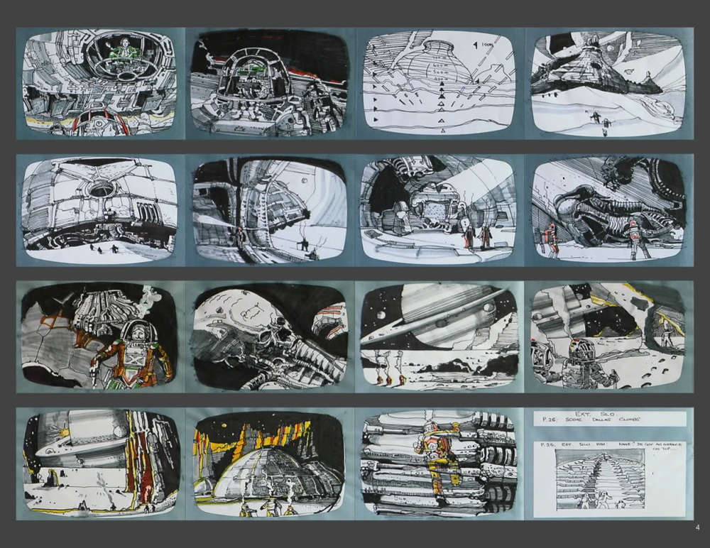
Ridley Scott Story board for Alien.
Ridley Scott took on the role of directing Alien in 1979, which is based around an aggressive creature designed by Swiss artist H.R Giger, who managed to create a swift, angular extraterrestrial being that was dark and equally terrifying. Ridley Scott not only directed the feature, but also created the storyboards for Alien.
I decided to research these storyboard not only because I am an fan of the franchise, but also because of how detailed and stylized Scott's storyboards are. They manage to create a sense of depth and emptiness which to me is incredible considering the limiting size of a storyboard thumb nail.
The camera angles are simple and enable Scott to show what's going on within the shot, which seemed to of translated quite well because there are a lot of similarities between the storyboard and the film. Throughout Scott's storyboard, he experiments with light and dark to portray the deep darkness of space and the isolation that is prominent in the film.
The only element that I haven't seen within Scott's storyboards that I have in a lot of storyboards, is the demonstration of action and movement using arrows or notes. In some of the shots you have to sort of assume that there's movement based on life within the image. In the storyboard below you can sense the aggressive movements from the blood splatters and the chaotic sense within the picture. I think that this is quite hard to achieve when starting out drawing storyboards because the kinds of movements that Ridley Scott is trying to depict are difficult to portray at first.
Ridley Scott tends to use single words to describe what's going on within the scene. For example in the one pictured above he uses the word "mess" which accurately depicts the scenes atmosphere and chaos.
Overall I feel that Ridley Scott created a successful story board because he managed to show action, isolation and perspective within his drawings.

No comments:
Post a Comment