Below is my initial post-it-note storyboard, for the Nursery Rhyme Rock-a-by-baby. When creating these, I always considered the camera angles and how I could show depth and direction in the small window.
Here is my first initial idea for the opening shot. I enjoyed experimenting with the first few shots because of how I was able to create a sense of scenery. A lot of my notes on these initial sketches focussed on how messy the lines were, and questioning what style I was going to stick with because at first I didn't know whether I liked the look of having a sinister looking tree, and quite a simple, generic looking baby. I also felt like I needed to work on creating a sense of weight where the baby was on the tree branch and swaying.
On these two pages I continued the story. I found that overall, I needed to work on perspective, and a few of the shots. For example the bottom right corner sketch needed to be centralised, and further shadows and depth needed to be created to fully communicate the vertigo shot. I also introduce the first detailed close up of the babies face, that expresses the first shock and confusion of the initial snapping sound of the branch.
Here, I continue with the theme of the detailed, gruesome close up of the baby expressing terror. I also continue to show movement and direction using rough arrows.
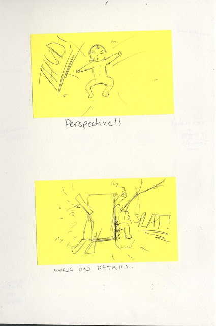
Here are my last two shots. In the one on the top, it is obvious that I needed to develop perspective, and detail.
I included arrows and sounds to give a sense of movement and life. Because these were such quick sketches, i didn't have much of a chance to create detailed images.
After creating these, I stuck them in my sketchbook so I could annotate and analyse each window so I could see how much development I needed, and what I needed to concentrate on.
I decided that I needed to work on creating a sense of surroundings by including backgrounds, which is shown in my later concept sketches. I also felt that I needed to work on the branch snapping, because I drew the image off the top of my head and didn't use reference photos.


No comments:
Post a Comment