After meeting with my group, we discussed textures and also the illustrations that I brought. Bronte also brought her illustrations that were a lot clearer than mine. We all decided that because we were not dead set on a certain style as of yet, that both me and Bronte would experiment further with different styles and textures of the characters.
I decided to put myself forward to create some water colour textures to use for the background of our posters and the Bear cars. We discussed the colour palette, and I suggested using a bright yellow to contrast the dark blue of the sea. I also suggested using oil pastel like textures for the title on the poster and also for the name of the fishes on the cards. We all seemed to agree that this would be the look of the poster.
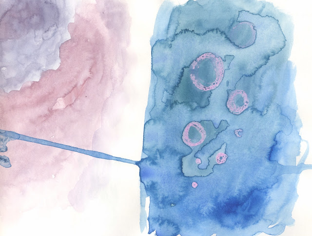
Here I created a sheet that had was made up of a dusty blue water colour. I decided to layer the water colour and build up certain areas to give and uneven and blotchy look.
I decided to experiment with a wax resist method. I used a pink crayon and washed over it with a dark blue. It didn't work as well as I hoped so I think it would work better using oil pastels instead of cheap crayons. We came to the decision to use yellow for the text but I decided to experiment with pinks and greens to see what they would look like against the blue backgrounds.
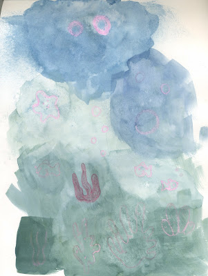
I decided to use a darker, thicker blue for this one in order to see how much depth I could give the background without giving it any dimensions because we want everything to look flat but textured.
I also did a couple of quick drawings of filler designs to have in between the fishes to bulk out the poster. I plan on showing these to my group to see if I could take over designing the background images.
Here I used pink crayons for the outline of the designs and blue water colour over the top. However, the watercolour didn't separate very well over the top of the drawing. The blue water colour wasn't as intense as I was hoping for as well.
I went back to the initial poster idea in order to try and create a slight gradient as I suggested that the blue could intensify towards the bottom and the illustrations of the deep sea fish could be towards the bottom to symbolise how deep in the sea they could be found. I decided to do a couple of little drawings in white pen to see what the contrast would look like. Personally, I think staying with the yellow hues would be the best way for us to create a stark contrast as well as having a unique style overall.
I decided to crate a yellow water colour block as a reference to the yellow tones that we wants to use.
I decided to do a quick sketch of an octopus with a small section that would be sample colours for the illustration. I quite like the cartoon like look of the image, and for the illustration to correspond with it's fact, the idea would be to have a little x-ray machine in front of the octopus to show his 3 hearts.
When I showed this to my group we decided that I could create the octopus card while Bronte illustrated the images of the Angler Fish as well and the Sea Slugs.
I decided to create a few more illustrations that played around with textures and colours as well as the aesthetic of the drawings.
I decided to draw the narwhals using water colour and fine liner. I feel like the patchiness and texture is a really nice touch to the drawings as a lot of children's drawings consist of block colour so this texture makes for a unique look.
I created this pink watercolour sheet to maybe use for the coral and other little details like star fishes.
I redrew my image of a catfish in just pencil to hopefully later be coloured in digitally. Even though at this point we do not know exactly what creatures we want to include in the card designs, we discussed that the main ones would be an octopus, a catfish, sea horses and sea slugs that me and Bronte would focus on creating sketches for and chose the better suited ones.
I did two different sketches of a seahorse, one with the details and one with out. We all had an understanding that the illustrations that we would create would be full of texture, however when creating the sketches at this point, to make it easier to colour in digitally, me and Bronte would focus of creating line drawings.
I took my time drawing the jellyfish because I didn't want the lack of details to take away from the designs itself. I decided to draw one with an old man face to fit in with the idea that jelly fish have been around for thousands of years.
I decided to do a quick mock up of the typography using yellow oil pastel under blue water colour. When I presented this to the group, we all agreed that we liked the gritty and grainy texture of the oil pastel under the watercolour. They also liked the yellow and blue combination, so we will probably use this colour combination in our final designs.
As a group we decided to create a little time table to break up the jobs and see what time scale we were working with. We had created a brief one when we first met up however it was quite unrealistic and we weren't very sure about what roles everyone wanted, and we felt like we were all fluid with what roles and tasks we wanted to do. We knew that Sophie would be best at composition and typography which would come at a later date, so me and Bronte would be in control of the illustrations for the main part. I still put myself forward for the colour palette that we would use for the background and text and also for the textures that we would use also.
We also created a facebook group chat as well as a shared Google Drive so we could communicate outside of our time tabled sessions.
My next step is to experiment further with textures and designs of the illustrations.
We also created a facebook group chat as well as a shared Google Drive so we could communicate outside of our time tabled sessions.
My next step is to experiment further with textures and designs of the illustrations.


No comments:
Post a Comment