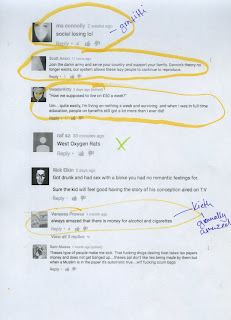
Some quotes were comedy gold and would have been funny to have in our animation, however they were obviously internet comments and we want our animation to have a big reveal at the end of it. A lot of this week consisted of discussions over the script and concepts that we all have. It's really nice that we all have these great ideas for our animation, however, it is only a 1-2 minute animation that we need to do so deciding what to keep is really difficult for us all.
Here I decided to develop Keith's facial features. As a group, we all really like the textured lines that both me and Tess created in our early stages. I experimented with the positions of his eyes and also his nose shape. I really enjoyed developing Keith, but again I can find it difficult for me to show people, especially Jay and Tess.
Tess showed me how to use the Masking tool in photoshop because we are thinking about having just his suit Masked throughout the animation. I quite like the look of it, however I am quite forgetful and kept having to bother Tess about how to do it. I practised the process a few more times but still couldn't get the hang of it.
Because I'm not very good at using drawing tablets, I decided to try and develop my skills by drawing over the sketches I had created of Keith. You can blatantly tell which one I drew over and which ones I free handed, which gave me some really weird looking Keith's, however they also made me realise how much better he looks with even eyes as well as having them quite oval in shape.
I created a couple more sketches of what his face might look like from the side. This is where I decided I really want his pout to only come out when he is facing to the left or right. I think this could be hilarious and really make him come across as vain and ridiculous.
Here, I added colour and also experimented with colours. I really like the various colours that I used for the different lines. I also quite like how his face is just white, I feel like this would stand out against the colourful and textured backgrounds. I still think the hair on his head should just be black, as I think there's too much going on when his cheeks and nose are ink, as well as his outline being blue. Overall, I feel as though Keith is almost there looks wise.
My next step is to finalise his designs as an individual, and as a group we are aiming to get our script done as soon as possible.


No comments:
Post a Comment