This was my set up for my animating process. I was initially going to use the black bin bag underneath the glass as the black background, but the glass was a lot more reflective that I initially thought. I decided to do my animation from home because I felt like the medium I was using would be too messy to use in one of the studios.
With the sheet of glass, I decided to do a textured and thick layer of black/dark purple oil paint as a base to cover the extremely reflective surface of the glass. If I was in a proper studio with better and consistent lighting, I feel like this layer wouldn't be needed.
I overall felt comfortable in the set up and was quite proud that wires weren't scattered everywhere and I didn't have to worry about ruining my work space with the paints.
This was my first test shot of Bing's mother. Unfortunately, because I'm using a trial version of Dragonframe, when I viewed the images in Photoshop, a watermark appeared. This was extremely frustrating. The pictures turned out an awful lot darker than when I had taken the images.
From this image, I decided to add more light to my set up and also brighter colours to my animation. I also switched from using coarse paintbrushes to spatulas to pack on the oil paint.
 |
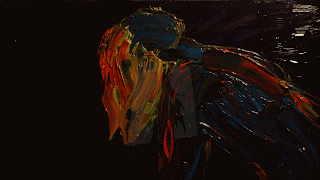
With these two shots, I decided to add vibrant colours and also a slight difference between the two. When I played them back in a gif, the difference made the effect that I was aiming for. I want my animation to have a bright and vibrant look, and also messy and expressive with a lot of darkness in the background in order to fit in with my book themes.
I found it really difficult and frustrating because the background was made of black oil paint with a slight purple hue to it, which would mix with the colours I would layer over the top. This made my test animation inconsistent and messy to deal with.
Overall, I feel like this test animation was unsuccessful. It was frustrating having to deal with the colours mixing together to make mucky colours, which was the opposite to what I wanted. I feel like the image in general failed. The composition was difficult because I knew I would have to crop the size of the image when creating it into a short animation. I definitely painted the image too big. I will reconsider the size of my composition and image when creating my final animation.
My next step is to reconsider the image itself, because I plan on not having a lot of movement in the image, but many variations of the image compiled after each other to create a flickering look to it.


No comments:
Post a Comment