Tuesday, 9 February 2016

Visual Language - Study Task 2 - Character Animation Crash Course by Eric Goldberg - Body Shape


In this book, Eric Goldberg goes through the key characteristics and techniques that go into designing characters that are to be animated.

In his chapter about Character construction and Design, he mentions how a cartoon character construction is typically based on circle and par-shapes. These tend to be more fluid to animate and easier to turn around due to their round and simple shapes.
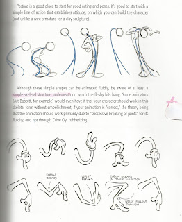


Goldberg points out how important posture can be to express a characters emotion. A simple line of action is what tends to be used to establish attitude, which you can build on in order to shape the character. However, that being said, a simple skeletal structure should be taken into account when animating. These skeletal underlying structures are key to creating fluidity through an animation due to the "successive breaking of joints".


Even though characters are usually drawn from simple, rounded shapes, the feeling of key anatomy will benefit your character into making them defined. The image of a "pudgy" character is beneficial to me because my character is very round and soft. I feel as though I have taken into account how my characters fat sort of shapes off into soft points around the edges in order to give my character shape and dimension instead of him just being a circle.
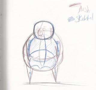


This is the first sketch I have done using the idea of my character having a skelotel structure to build upon. I found this difficult because of how round and large my character is. It was confusing to see what I had attempted to do, so I drew a key in the corner so it's easier to understand. I feel as though the "skeletol rule" applies well to my character, because of how the ribcage fits well with the top half of his body.
This was the first sketch I did that involved a skeletol structure and gesture line underneath to work on. I feel as though this technique would be most helpful when creating thin characters, as well as characters that are made to portray dramatic emotions. I feel as though my character is restricted with his movements because I would want to maintain his hefty, round structure as well as keeping with the theme that he is lazy and out of shape.


I attempted to draw some more dynamic poses of my character. The first one of the left of him running, and the one on the right being proud. I found it easier to draw him with the gestural spine line rather than just his outer shape first. I feel as though this line definitely helps to create emotion.


I attempted to create further emotions using the guide lines and tips from the book by Eric Goldberg. I found it a lot more helpful when drawing my character in dynamic poses to convey his emotions, because of the simple line of action to work on top of. 

Overall, this book has helped me gain an understanding of how designing a character requires ground work to layer on top of in order to convey and emotion or action using the body as well as just the face. Using a gestural line to build upon helps portray and exaggerate a characters movement.

Visual Language - Study Task 2 - Captain Character - Key poses


These are the first set of initial key poses I have created. I think that I have successfully captured his characteristics and demonstrated the weight of my character through drawing him from various angles and interacting with objects. By drawing my character from different angles, I feel that I have captured an understanding of my characters shape from different perspectives through the use of dynamic poses.

I attempted to demonstrate a sense of weight to my character by drawing him in positions where his weight would be accentuated. This is shown in the middle image where he is lying on a coach, in a slouched backwards position. I decided to draw him from this angle in order to demonstrate how round and soft he was by having his fat bulge out at points around the couch.
 In the bottom right I decided to draw him struggling to pick up some papers in an attempt to demonstrate his struggle with his weight, and play around with how gravity can effect certain features, such a his belly and his moobs.  


Here, my aim was to add more personality to my character. I wanted to demonstrate how I want my character to be perceived through the use of drawing him doing daily activities. Bottom right is him at his office job, eating a burrito, which I feel captures my characters lifestyle. I also drew him watching a scary movie with his cat, and also attempting to get into his pyjamas. I feel that these 3 drawings clearly depict my characters disposition by showing how simple and content he is through daily activities.


Visual Language - Study Task 2 - Captain Character - Emotions


I feel that to an extent, I achieved portraying emotions and actions using my characters facial features. I feel that I did this through accentuating certain features, such as his nose, eyebrows and wrinkles in order to depict these emotions. For example, in the drawing of him sneezing, I exaggerated his nose size and his nostrils to create a focal point of this action. The sketch I did of him looking at a dead butterfly, which is meant to depict sorrow and sadness, I made his nose hang further over his mouth, and lifted his mouth up slightly to give a sense of sadness. This is something that I learned from Eric Goldberg's book called The Animation Crash Course where he discusses how important drag is on features of a character when movement is involved.

Adding details such as wrinkles emphasise my characters movements and emotions, and also portray a sense of texture to his skin. 

Visual Language - Study Task 2 - Facial Construction


In this segment of Eric Goldberg's book, he brings to light how the starting point to constructing a head is basic shapes to allow room to build upon. For example, the most commonly used shape to build up on is again, the circle. This shape allows the animator to access and create various expressions through the movement of the fleshy parts of the face.

Basing a head around a circle, or simple shapes, easily allows you to visualize the head from different angles.


Here, Eric mentions how generic shapes make for generic characters, and how certain shapes can set the tone for a character. Designing an angular character still can use circular shapes as the base, to make them less difficult to animate. Basing a character around circular shapes allow for a more comfortable looking character, and historically makes them appealing.

Because my character is based around a circle, I decided to test the advice given in this book. 


Here, I drew circles and built upon them in order to create my character. I was already doing this initially when drawing my character, but I always drew the basic shape of the head instead of a straight, clear circle.


Here, I clearly presented how I built on top of the circle. I extending his jowls further to create a sense of flesh sagging. On the right, I sketched him bowing his head to capture the shape of his head. I keep the shape of his cranium spherical in order to show how gravity weighs down certain features like his cheeks and nose.


Here I attempted to draw my characters face in motion in order to demonstrate how soft his skin is on his face. I feel like I could develop this further by squashing and stretching certain areas to depict a sense of motion. I feel as though I tried to play it safe with this drawing by staying true to his original face shape, however I think this hardened my characters features.


Because my character eats a lot, I decided to attempt to drawing him at different stages of eating. I feel like I applied the squash and stretch rule successfully because it exaggerates the motion. I also took into account the fact that movement of soft features require a sense of drag. I have the nose squished and a little stretched out horizontally in the first image, and then have the nose elongated and thin in the last image to create a sense of drag against gravity. If I was to animate and develop my characters eating motion, I would have the jaw move in a circular motion, and have his nose move with the chewing, squashing and stretching along with the face.


I feel as though my character's face is comfortable to look at due to his simple and rounded features. However, I feel as though I have successfully portrayed his back story and personality through his features also. By using the facial construction rules that Eric Goldberg highlights, I have created more of an understanding of how to build up on a characters face with ease.


Monday, 8 February 2016

Visual Language - Study Task 2 - Captain Character - Hair Development


I decided to develop the hair for my character in order to create a well-rounded character design. I went form one extreme to the next by switching between styles and lengths in an attempt to capture my characters personality. He is a lazy character, that doesn't shower or care about his appearance in any way.

This one is where I attempted to draw him with barely any hair apart from a few strands that are combed over the the side. I felt as though this aged my character far too much. My character is meant to be middle aged and I feel as though too much or too less of hair can age or add youth to my character.
This one made my character too stylish. My aim was to create an outdated quiff, that captured my characters weirdness. However I feel like at first glance, he was made to look like an Elvis impersonator. Which is something I definitely don't want for my character.


Here, I decided to give him a Tu-pay. Even though my character is meant to be strange and weird, I still want an element of amusement and cuteness about him. I want him to be quite stupid and funny, so I felt as though a Tu-pay would give this laughable, silly pay off. However, I still felt as though he wasn't greasy enough, or has any sense of weirdness about him on his face.


I'm not too sure why I did this one. I feel as though I wanted to re-create a Superman style curl. However, this experimentation makes my character look like a big, aged baby. Which is obviously the opposite of what I wanted.


Because I want my character to have a sense of silliness about him, I decided to draw him with an extreme mo-hawk. These gives my character a punk sort of attitude which doesn't fit in with my characters back story or with his personality. So I decided not to go with this look either.

I feel as though this look could work for my character, as it's a practical hair style. It sort of demonstrates the content and simple side to my character through the short, shaven head. 

After drawing him with short/shaven hair, I decided to go for a long hair style as I hadn't drawn one yet. I feel as though this perfectly demonstrates and portrays my characters attitude. It shows how he's even too lazy to get a hair cut, so he just grows it out to save the hassle and his mums money. However, I feel as though he could be mistaken for a female character if not executed right. This hair style seems too feminine.


Here I felt as though I found the perfect hair style for my character. I feel as though it's the perfect length for my character. The thin, separated lines give a sense of fine hair, and the bald top also demonstrates a sense of balding. 

I feel as though my characters face has come together nicely, and represents my character back story and history in a true way. My character comes across as neglectful towards his appearance through the way his hair looks greasy and flat, and also through the fact he has a few spots on his face. 

My next step is to experiment with extremes on the face by shifting the placement of the features dramatically.


Thursday, 4 February 2016

Visual Language - Study Task 2 - Captain Character - Front and side view


This is the front and side view of my character. I worked out that he would be exactly 4 heads tall. I Think that I successfully managed to create depth and dimension and shape to my character. The style of my character is meant to be simple as it is my first experience thoroughly designing a character, so I didn't want to push myself too far by establishing a style, when it wasn't involve in my brief.
From my past drawings, I saw that my characters head still wasn't the right shape for my liking. This thought has caused me to draw his head a bit more squished vertically to fill out his face further.


This is my 1/4 and 3/4 angles of my character. I feel like my character is a fairly easy character to draw from different angles because of his basic shape. When I design characters in the future, I will definitely challenge myself, and create characters that have a lot of room for extreme poses and facial expressions.


This was a quick sketch I did as a reference when drawing my character on a larger scale. I found this helpful as my other sketches haven't been of him with no expression.


This is a final, cleaned up version of my character for my character sheet. I feel that from looking you understand his round, soft form from the overhanging belly and his slouching arms

Overall, I am happy with my character's final look. I feel that he would be hard to create as a puppet/armature because of the size of his body. I also feel like I would be restricted with animating a puppet of him considering the only things that would be able to move is his arms, legs and facial features, and I feel that materials would be limited for me to create an articulate face.

My next step in developing my character is through thorough sketches of my character in various poses to gain a further understanding of how characters features affect how they are perceived. 


Tuesday, 2 February 2016

Visual Language - Study Task 2 - Captain Character - Extremes


As part of this project I was asked to experiment with the placements of my characters facial features. The first one being the original and the rest being the experimentations.


Here are all of my drawings.


I feel as though The placement of the eyes closer together makes my character look a bit "toony". I want my character to have a strong element of human about him, with his features evenly spread and placed on the head in order to stay true to his boring, and human life. So, this variation is one I wont be pursuing.


This was my second attempt at experimenting with the placement of facial features. I decided to go in the opposite direction to my first iteration, by spreading his eyes far apart, and placing his ears higher. This elongates and widens his face. I kept the nose more or less in the same position as the original, and also shifted the mouth to the right.


My character here looks too much like a frog. I stuck to the idea of keeping the nose and mouth low down on the face because I felt as though that fit my character quite well. Having the facial features lower and closer together makes him look a little bit more simple, and the right amount of "toony".


Here, I brought the ears slightly forward. This makes him look dopey, and gives him a sense of stupidity that is typical of characters with large, exaggerated ears. I like how his nose, eyes and mouth are closer together and further down the face.


With this sketch I exaggerated the placements way too much. It makes him look a little supernatural and inhuman. 

I found this experimentation helpful in the sense that I understood my characters facial features more. However, I decided not to pursue any of the extremes that came out of this experiment as I felt that the character's facial feature placements where okay. However, I have decided to place his eyes, nose and mouth closer together and further down the face, in order to make his appearance look more like a cartoon, yet still keeping a human aspect to him.

This practice is something I will use in other projects in order to develop a character's facial features in order to show a range of development.